


For his rematch with Zohran Mamdani, Andrew Cuomo got a brand-new logo
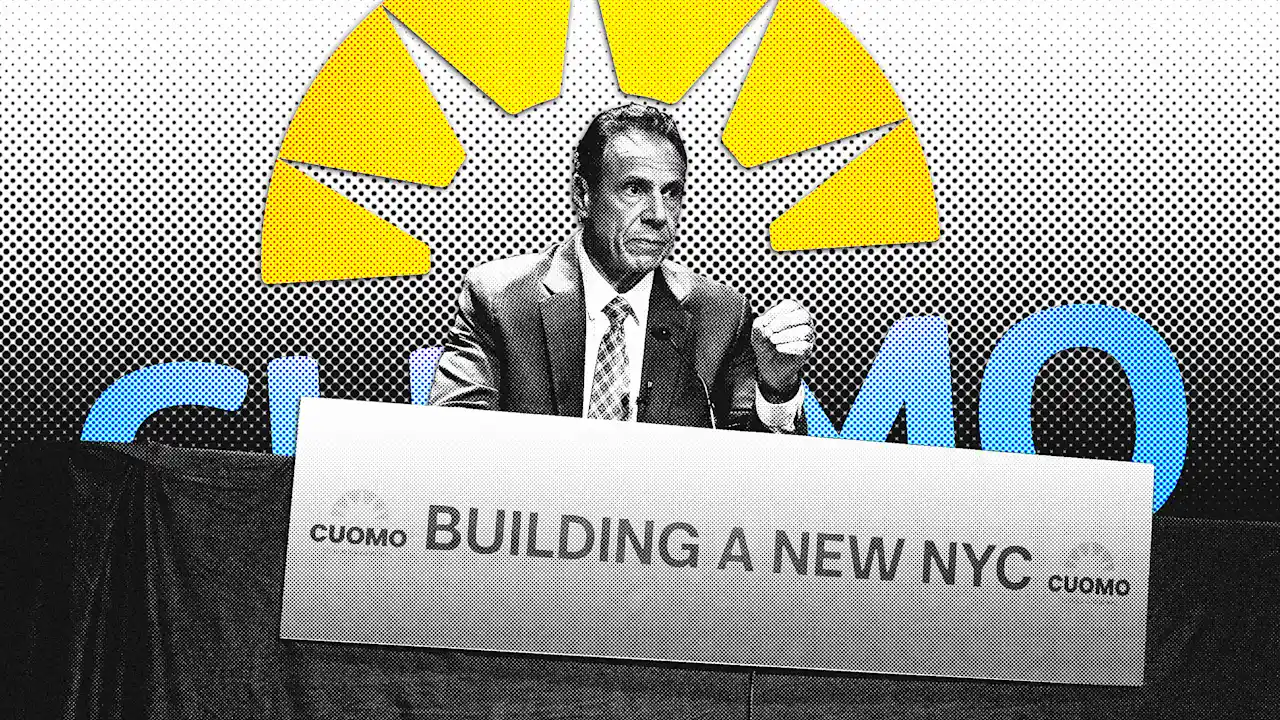
New York City mayoral candidate Andrew Cuomo recently unveiled a new campaign logo at a press conference that was designed like his pandemic-era briefings when he was New York governor, complete with a video screen he used for a PowerPoint presentation.
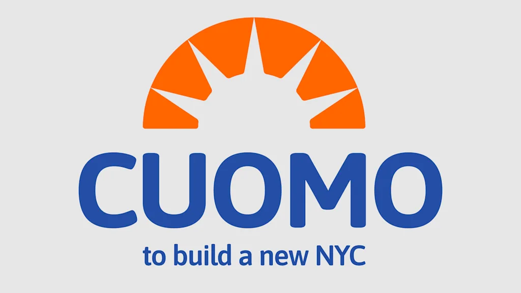
The new logo is “supposed to symbolize a new phase of the campaign,” Cuomo spokesperson Rich Azzopardi tells Fast Company. The mark was designed to both evoke a rising sun and resemble the Statue of Liberty’s crown. Azzopardi says it’s no coincidence the brand’s blue-and-orange color palette is the same as the New York City flag.
“Cuomo, to build a new NYC,” the logomark says in a sans-serif typeface with soft rounded edges that resembles Calibri, the font that Microsoft used as default on Outlook and Word until replacing it with Aptos in 2023. (Cuomo’s campaign could not verify the typeface used.)
Cuomo’s new logo might not win any graphic design awards, but it’s an improvement from the nondescript, under-branded logo his campaign used in the Democratic primaries. What’s more, it signals Cuomo’s campaign has realized paying attention to its visual rhetoric matters in a race against New York State Assemblyman Zohran Mamdani, whose unconventional, well-branded campaign identity stood apart in the primaries.
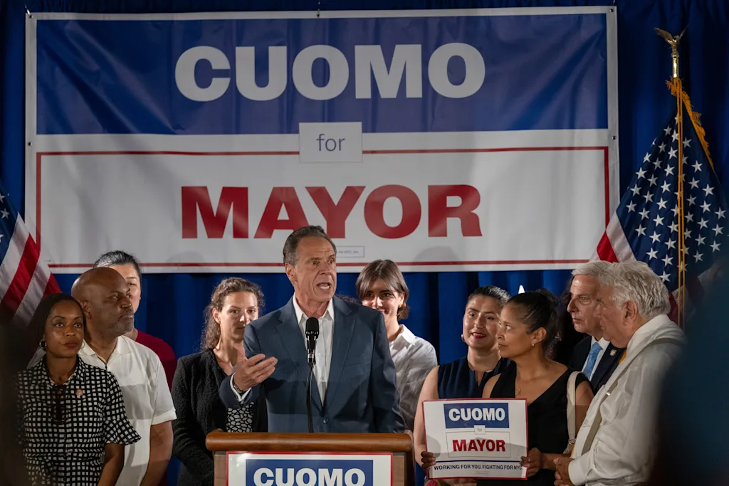
Cuomo’s old primary logo, a blue block that said “Cuomo” stacked on top of a red outline of a rectangle that said “for Mayor,” was generic. Change the name and office, and it could be used for political campaign, and it relied on the candidate’s name instead any sort of interesting or memorable visual element.
In a race where his opponents made clever use of typography as both a branding mechanism and tool to drive home campaign messages, though, it was clear Cuomo’s old logo also didn’t have much to say.
Like a consumer packaged good brand that redesigns its packaging as a response to dipping sales, Cuomo’s new logo is a new wrapper over an established political quantity. It’s a new-look-same-great-taste sort of rebrand that was designed to look optimistic and fresh, even as Cuomo emphasizes many of the same talking points he did in the primary, namely his experience.
At the press conference where he first used the new branding, Cuomo unveiled his plan for improving and reforming the city’s policing, and questioned whether Mamdani would be able to deliver on his promises. Cuomo suggested voters ask themselves which candidate would deal with the city’s “operations and the systems in a way that’s going to help me,” and not “just give me promises and slogans.”
“We’re running a different campaign in the general election,” Azzopardi says, calling it “more nimble” and “affirmative.” Still he adds, “We never are going to out-Mamdani Mamdani.”
Mamdani ran a bespoke campaign tailored to him that was well suited to reaching young people online. His logo was inspired by city street signs and vintage Bollywood movie poster type. That helped communicate and reinforce his campaign message of newness and change.
Cuomo’s not that kind of candidate, but he is responding to Mamdani’s primary win with brighter graphics of his own, though with a boring font you might have found in old emails and PowerPoint presentations.
That’s a far less exciting visual reference than those Mamdani’s campaign drew from, but it also reinforces Cuomo’s message of experience and getting stuff done. For a candidate known for his PowerPoints, it just might have been the smartest choice.
What's Your Reaction?
 Like
0
Like
0
 Dislike
0
Dislike
0
 Love
0
Love
0
 Funny
0
Funny
0
 Angry
0
Angry
0
 Sad
0
Sad
0
 Wow
0
Wow
0