


.jpeg?width=1200&auto=webp&trim=0,100,0,100#)


![Big Brother Recap: Rachel’s HOH Sends [Spoiler] Packing](https://tvline.com/wp-content/uploads/2025/08/big-brother-live-eviction-week-6.png?#)


This simple shape turned the Coca-Cola logo into a timeless icon
Today, Coca-Cola has one of the most iconic brand identities in the world—so iconic, in fact, that one 2010s study found that “Coca‑Cola” is the second‑most widely understood term in the world after the word “okay.” But the brand’s modern global footprint might look entirely different if it weren’t for one major design overhaul in 1969 called Project Arden.
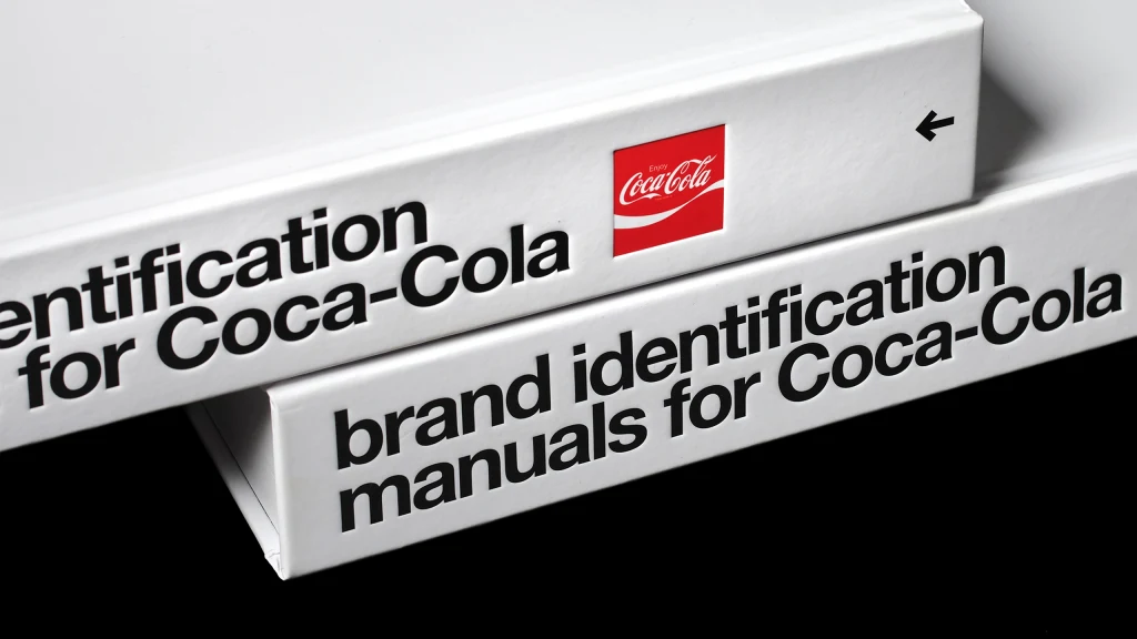
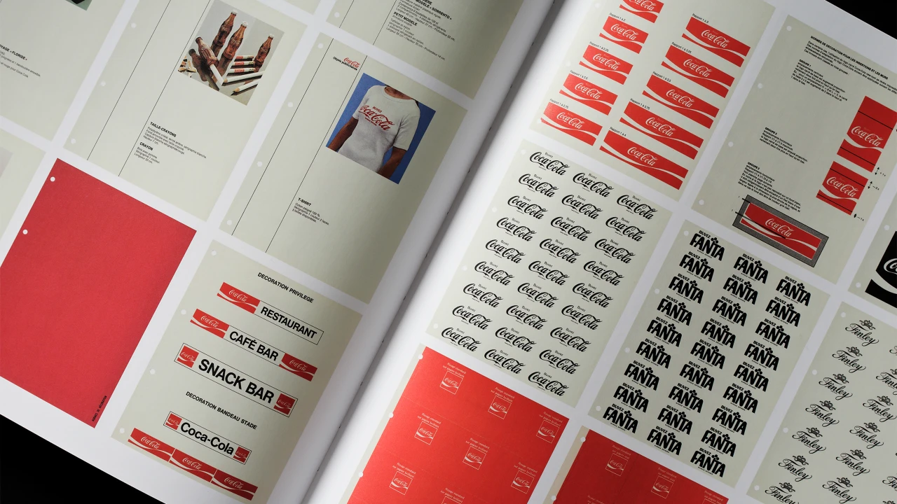
That pivotal era of Coca-Cola’s history is the focus of the new book, Brand Identification Manuals for Coca-Cola, published by Standards Manual and designed by the firm Order Design. The book compiles seven brand manuals and dozens of additional materials, circa 1969 to 1979, from The Coca-Cola Company Archives. Perhaps most notable is its documentation of Project Arden, a design effort spearheaded by Walter Margulies, partner at the design firm Lippincott & Margulies. His team’s directive from Coca-Cola was an intimidating one: to create a cohesive corporate brand system for the beverage company at a time when it was scaling up exponentially.
The overhaul was nicknamed Project Arden as a nod to the Elizabeth Arden beauty salon, best known at the time for its signature fire engine–red front door. Project Arden’s core visual system, the simple-yet-versatile Arden Square, would become one of the most influential branding assets of all time.
How Project Arden paved the way for Coke’s branding
Margulies’ approach to Project Arden started not with how his team could change the brand, but how they could preserve its most important features. By 1969, the Coca-Cola serif logo was solidly engrained in consumers’ perception of the brand, alongside the brand’s bold red, which Margulies called “highly motivational.”
In years prior, though, the logo was a bit tricker to pin down. It sometimes appeared in backgrounds depending on the application, from a red disc for advertising in the late ‘40s to a tag-like arciform shape for signage and vending machines in the ‘50s. As Coca-Cola set its sights on global expansion, the company’s executives realized that a more cohesive branding approach would be key.
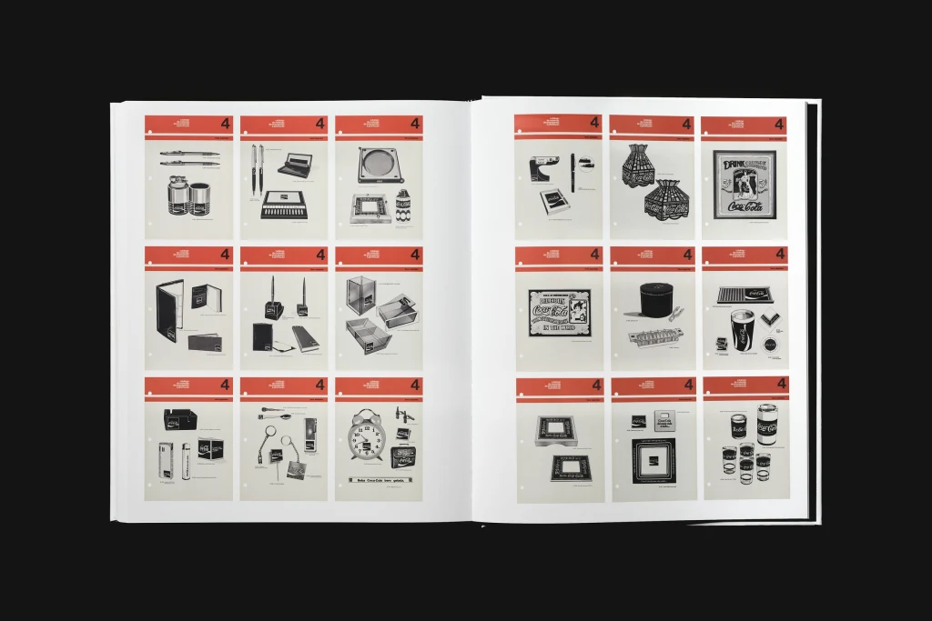
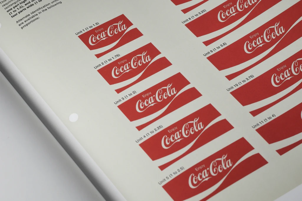
Lippincott & Margulies’ aim, then, was to create an identity that would both elevate Coke and allow it to maintain brand familiarity, all while also devising a scalable look across packaging, product, and advertising. Their solution was to boil Coke’s identity down to a few core design elements and lay out a clear set of guidelines for how they could—and could not—be used. According to Jesse Reed, a partner at Order Design who helped create Brand Identification Manuals for Coca-Cola, the final Project Arden system comprises “less than a half dozen elements of design.”
“The firms that [Coca-Cola] was working with at the time, like [Lippincott & Margulies], pulled from the Swiss school of thinking, with minimalism and the idea of reduction as the best path forward,” Reed says.
Project Arden maintained Coke’s script logo and core red. However, it substituted the former circle background for a square, which could also be elongated into a rectangle; added Helvetica as the brand’s main typeface; and created a brand-new asset now known as the Dynamic Ribbon, a fluid white band that Reed describes as the “connective tissue” supporting the branding.
All of these changes are best represented by the Arden Square, a red square that contains Coca-Cola’s serif logo, the Dynamic Ribbon, and the word “Enjoy” in Helvetica. Lippincott & Margulies’ system specified exactly which dimensions could be used to elongate the mark into a rectangle for product labels, advertising, packaging, and even signage for Coca-Cola’s fleet of vehicles. The brand standards also include examples of “unacceptable” uses of the Arden Square, like reversing the placement of its red and white accents or introducing a new color into the mix.
“Beforehand, you would have something that was almost like freestanding or free-floating, but the Arden Square allowed Coca Cola to really use it in a modular fashion,” Reed says. “The Arden Square was the core DNA that allowed that structural device to really play out. It’s not scaled in an arbitrary manner: it gives order to what could have potentially been chaos.”
Why the Arden Square remains so iconic today
Today, nearly 60 years after the introduction of the Arden Square, Coke is still using an almost identical branding system, with the exception of small tweaks like the introduction of a custom brand font in 2018. Reed believes that consistency is a direct result of establishing a brand that relies on certain unbending guidelines.
“They knew that consistency and repetition was going to be the most powerful device in introducing this new identity, it’s one of the simplest Gestalt principles,” Reed says. “This entire identity in and of itself is one of the best examples of it being pulled off beautifully. They don’t compromise; they don’t allow for variations to be very easily introduced. And that has paid off.”
The longevity of the Arden Square and its component parts have effectively baked each of those parts into the public consciousness—so much so that a certain hue of red is likely to instantly evoke the brand. That lends Coke an inherent advantage over competitors in the beverage space who “have rebranded a dozen times,” Reed says.
“[Coke] is one of very few companies at their size and scale that have stood strong in the identity that they introduced at the very beginning all the way up until today,” Reed says.
What's Your Reaction?
 Like
0
Like
0
 Dislike
0
Dislike
0
 Love
0
Love
0
 Funny
0
Funny
0
 Angry
0
Angry
0
 Sad
0
Sad
0
 Wow
0
Wow
0