The decades-old design trick that makes every EV logo look the same
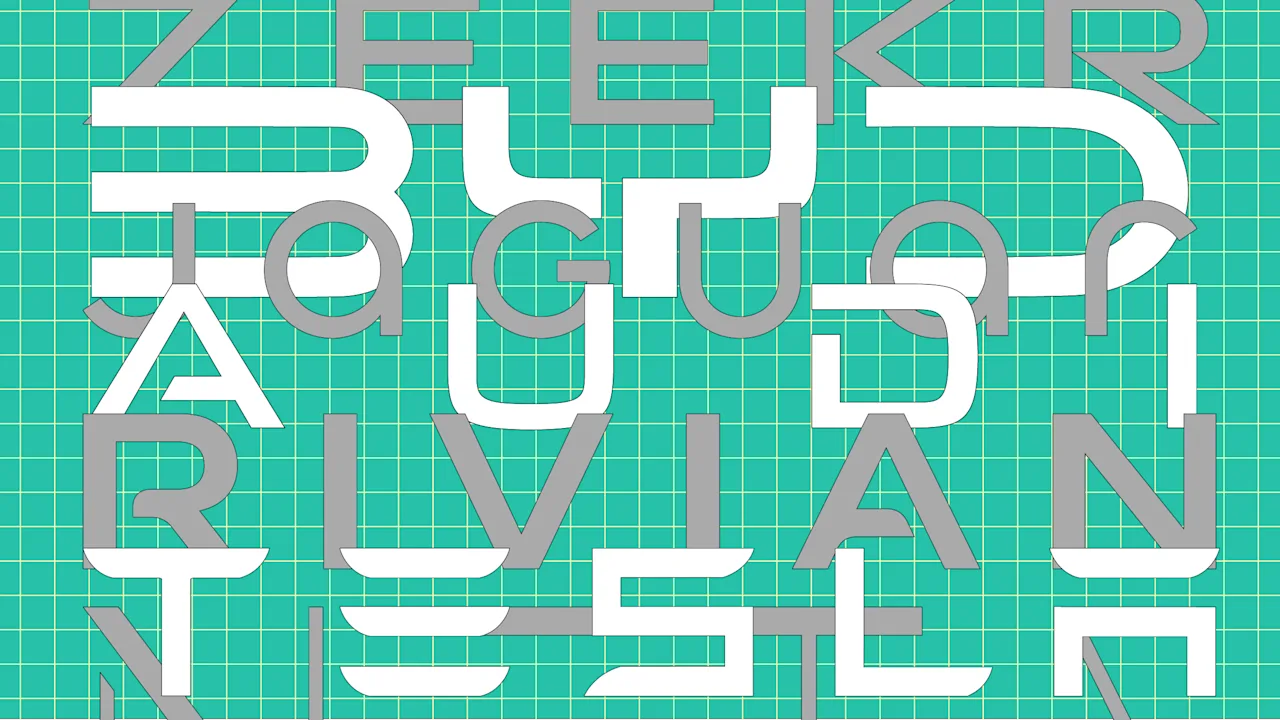
Maybe you’ve noticed it while driving down the road. The chrome logos. The sleek sans serif fonts. It can be hard to tell one electric vehicle brand from another.
There’s a reason EV brands like Tesla, Rivian, BYD, Neta, Jaguar, and Zeekr have become a sea of sameness, and it all comes down to a single influence: Many of today’s most technologically advanced cars owe their aesthetic to a decades-old vision of the future.
Most EV brands use a font that includes cutouts, slashes, or entire missing segments. This is a font style called “stenciling,” and if it looks inherently futuristic, that’s because it’s most often used in science fiction media.
“It’s shorthand for the future,” says Stephen Coles, editorial director and associate curator at Letterform Archive in San Francisco, who also authors a blog called Chromeography about the history of car branding.
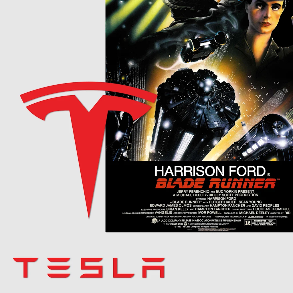
What Tesla has in common with Blade Runner
The classic 1982 film Blade Runner, set in 2019, imagined a dystopian version of Earth threatened by intelligent humanoids. It didn’t get a whole lot right about the modern day, but it turns out that some of the film’s aesthetics were pretty spot-on when it comes to predicting the branding of EVs.
Blade Runner’s original poster sets the film’s title in a stenciled font. Stencils are typefaces with slits in their letters that make them appear as though they’ve been cut, and they represent a printing technique that dates back to prehistory.
Historically, stenciling’s ease of replication has made it ideal for uses in the military, transportation, and poster design. But in the late 20th century, it also became a hallmark of science fiction.
Dave Addey, an Apple engineer and author of the book Typeset in the Future: Typography and Design in Science Fiction Movies, runs a blog where he analyzes typography in iconic science fiction films. Stenciling comes up constantly.
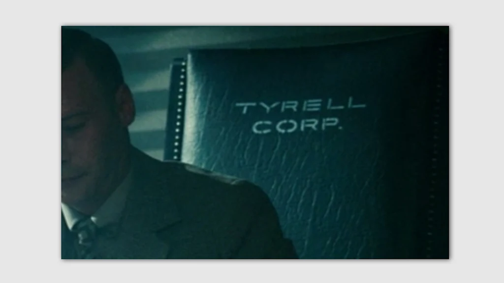
In Blade Runner, it’s used in the logo for the evil Tyrell Corporation. In 1979’s Alien, it appears in the film’s opening sequence and on the back of Captain Dallas’s jacket. Later, in 1989’s Back to the Future II, it pops up multiple times, including as a hypothetical logo for USA Today and in the branding of a Texaco gas station.
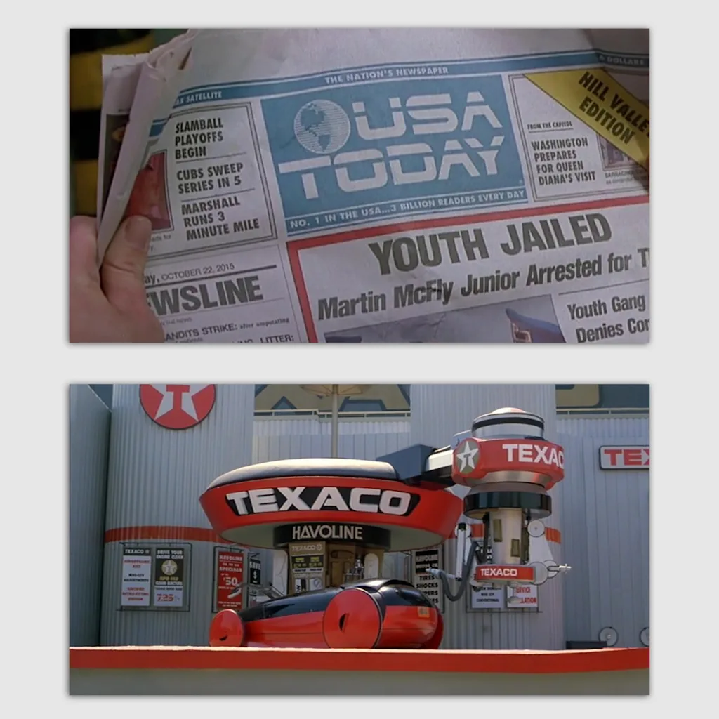
“If you look at the typography of those films, [stenciling] is something you see over and over again,” Coles says.
Stenciling is so ubiquitous in science fiction media that in a blog post titled “How to Make Your Text Look Futuristic,” Addey includes it as one of the key steps. “Rule 5: Remove an entirely pointless and arbitrary segment of the text,” he writes.
Among EV brands, Rule 5 appears to have become branding gospel.
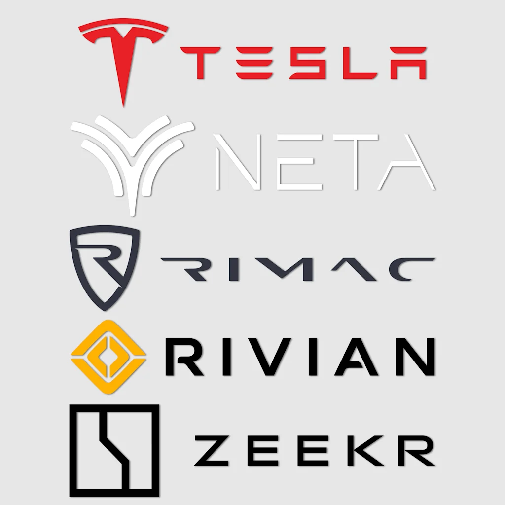
Tesla was one of the first brands to set the stenciling trend, but it was quickly followed by competitors like China’s BYD and Neta. Jaguar’s new branding has a bit of stencil in it, while the luxury EV brand Rimac takes this strategy to the extreme, erasing almost entire portions of each character. “It looks like it could be on the side of a spaceship in a sci-fi movie,” Addey says.
The great “blanding” of the automotive industry
It’s no surprise that the style is pervasive, says Terrance Weinzierl, executive creative type director at the type foundry Monotype. One of his theories for the connection between sci-fi and EV branding is that “the automotive industry is really a copycat industry.” Just look at the most divisive EV brand of our time as proof.
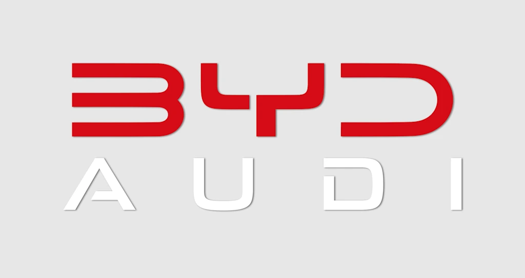
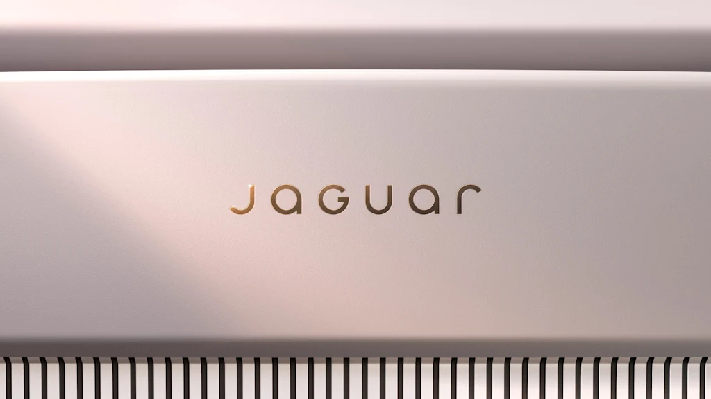
In November 2024, the legacy brand Jaguar announced that it would be shifting its focus away from gas vehicles and transforming into a luxury all-electric company. To usher in this change, the brand traded its iconic “leaper” cat logo for a thin, sleek, sans serif wordmark. Just a month later, Audi announced its own line of EVs in China, ditching its iconic four-ringed logo for, you guessed it, a thin, sans serif wordmark.
“The general trend in graphic design logo types maybe 15 years ago was to start going more geometric—the blandification,” Coles says. “There’s been a move away from serifs and other kinds of expressive type, which happened in the tech industry first. It seems like the car industry is 10 years behind that. [EV branding] feels to me like it’s a second phase of that general trend.”
This flattening was a precursor to stenciling. Weinzierl notes that legacy brands including Kia, Chevrolet, Subaru, Porsche, Lexus, Infiniti, Mazda, Hyundai, Dodge, Lincoln, and Acura have all opted for “flattened” sans serif wordmarks in recent years—a sharp contrast from the early days of car branding, when loopy scripts were everywhere.
Just like the blanding trend of the 2010s, if one successful EV brand (like Tesla, for example) sets a certain typographic tone, others might feel compelled to follow. Coles believes that brands are also using this technique to appeal to millennial nostalgia for retro-futuristic aesthetics.
“If you think of who would be buying cars now and what influenced their feeling of what is futuristic, a lot of the films that [Addey] talks about in his book are from that period—the ’70s, ’80s, maybe some early ’90s,” Coles says.
Of course, some brands stand out as exceptions to this general rule. The EV company Scout Motors uses a wordmark that pulls inspiration from the script automotive logos of old. Other luxury brands, like Bugatti’s Tourbillon model, are doing something similar.
Weinzierl says it’s important to remember that compared to the traditional automotive industry, EVs are still almost entirely new. As the category exits its nascent phase, we may see an increase in experimentation and brand differentiation.
“What I love about the EV industry is that there’s so much innovation and so much overhaul that’s happening,” Weinzierl says. “It reminds me of smartphones in 2008 or 2010—year over year, the products were just dramatically different, and there was so much competition and so much innovation happening really fast. I see the blossoming EV industry as a mirror image of that.”
What's Your Reaction?
 Like
0
 Dislike
0
 Love
0
 Funny
0
 Angry
0
 Sad
0
Sad
0
 Wow
0
Wow
0


