After almost 20 years, Goodreads has a new logo fit for Booktok
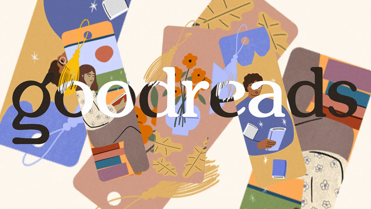
Goodreads just got its first-ever logo redesign, and it’s taking a page straight out of BookTok’s aesthetic catalog.
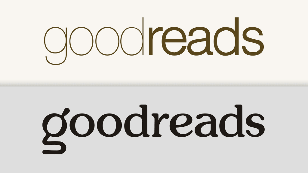
Since the book tracking and reviewing platform debuted in 2007, it’s generally used the same logo: A brown wordmark featuring the word good in a skinny sans serif and the word reads in a slightly thicker sans serif, all set on a cream-colored background. While the ultra-simple look was probably designed to evoke the warm atmosphere of a bookstore or library, it also veers perilously close to the corporate blanding aesthetic that ruled the 2010s. But in 2025, “bland” is the opposite of how one might describe emerging aesthetics in the book community.
Online platforms like Instagram and Tiktok have shaped the way publishers approach book cover design, which increasingly relies on eye-catchingly bright “dopamine colors,” chunky text, and swirling shapes to stop readers in their scroll. Carly Kellerman, then an associate publisher for Zondervan Books at HarperCollins, explained in 2022, “Instagram has made everything more aesthetic, from lattes to fashion trends to book covers to travel. I’m very cognizant of the ‘shareability’ of book covers as I craft the direction.”
As these eye candy covers continued to populate users’ Goodreads shelves over the past several years, the site’s own branding was quickly becoming incongruous with the book design of the times. On July 14, Goodreads announced a new logo that ditches the former staid look for a touch of modern whimsy.
A new logo with a hint of whimsy
Launched in 2007, Goodreads was acquired by Amazon in 2013 in a move that swept the book reviewing platform away from a potential deal with Apple. Since then, Amazon has routinely been criticized for neglecting the book tracker, which—on both its app and website—largely looks the same as it did more than 10 years ago. Just this June, Amazon announced layoffs impacting Goodreads, though the company declined to share specific numbers with Fast Company at the time.
In 2023, Jane Friedman, a publishing industry consultant, told The Washington Post that Goodreads “hasn’t been all that well maintained, or updated, or kept up with.” She added, “It does feel like Amazon bought it and then abandoned it.”
Now it looks like Amazon is finally turning a bit of attention to the platform with both a new logo and a few added features. The logo swaps its former minimalist font scheme for a chunky, rounded serif font with a bit more character. While the logo is still all lowercase, it’s significantly more bold, allowing it to stand out better on a screen.
“Our new logo is designed to better represent Goodreads and is optimized for accessibility so it looks clear and sharp no matter where you see it—from your phone to a billboard,” a blog post on the update reads.
The logo’s g character, which serves as a stand-alone symbol for the Goodreads app icon and social media profile pictures, has been fully reworked to incorporate a few bookish Easter eggs. According to the blog post, the upper half of the character is meant to evoke a magnifying glass, while the bottom half represents an open book, “symbolizing the book discovery and sharing of perspectives that are at the heart of the Goodreads experience.”
Platform updates improve flow and drive sales
Alongside the fresh logo, the blog post also shares a few updates to the Goodreads platform. Starting this week, the “Want to Read” section—which lets users compile books they hope to read in the future—will now also appear in “Your Books” on Amazon for readers who have linked the two accounts.
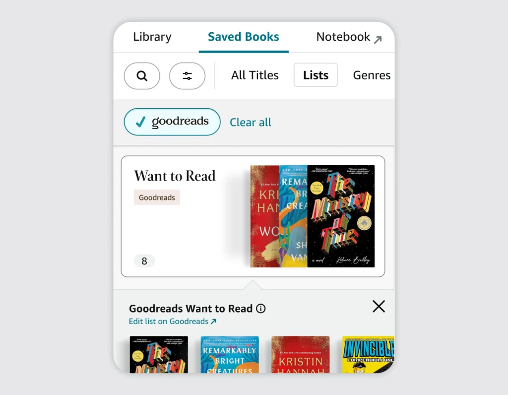
Essentially, it’s a way for Amazon to drive customers to acquire their reading materials through Amazon rather than an outside seller. (This might be a turnoff for some readers, given that a chunk of Goodreads users jumped ship and joined the competitor StoryGraph earlier this year to protest Amazon’s ownership of the platform).
In addition, the blog post notes that Goodreads is expanding its book catalog to include more than a million audiobooks, as well as building out its Reading Challenge feature to help readers meet their annual reading goals. On Reddit, fans are tentatively hopeful that the new logo and accompanying updates hint that Amazon is planning to modernize its broader UI.
“I guess it’s a good sign that they’re trying to implement some changes that I hope to be for the better,” one Reddit user wrote. “The site (and app) were practically frozen in time!”
The logo update, while admittedly subtle, signals that the platform might finally be a higher priority for Amazon—and that, to imagine what a future revamped Goodreads could look like, the bright new landscape of book cover design is one place where Amazon appears to be pulling inspiration.
What's Your Reaction?
 Like
0
 Dislike
0
 Love
0
 Funny
0
 Angry
0
 Sad
0
Sad
0
 Wow
0
Wow
0
