


Housing market shift: This map shows where home sellers are cutting prices the most
Want more housing market stories from Lance Lambert’s ResiClub in your inbox? Subscribe to the ResiClub newsletter.
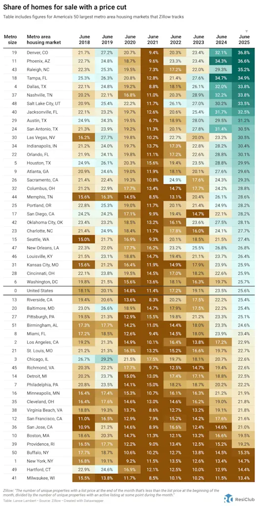
To identify which metro areas might offer buyers the most opportunity right now, ResiClub analyzed the share of homes on Zillow with a price cut.
Of course, just because a home listed for sale gets a price cut doesn’t guarantee that comps in that area are falling. After all, there will always be some sellers who overshoot their market. Even during the height of the Pandemic Housing Boom in June 2021, 11.4% of homes for sale that month saw a price cut.
The way to interpret this data is to compare it over time. If the percentage of homes with a price cut in a given area decreases noticeably (particularly, beyond the normal seasonal swing), it suggests the market has tightened and sellers have gained relative leverage. Conversely, if the percentage increases noticeably (again, beyond the normal seasonal swing), it suggests the market has cooled and buyers have gained relative leverage.
The national share of U.S. homes with a price cut is further confirmation that the housing market has been shifting, relatively speaking, toward buyers ever since mortgage rates spiked and the Pandemic Housing Boom fizzled out:
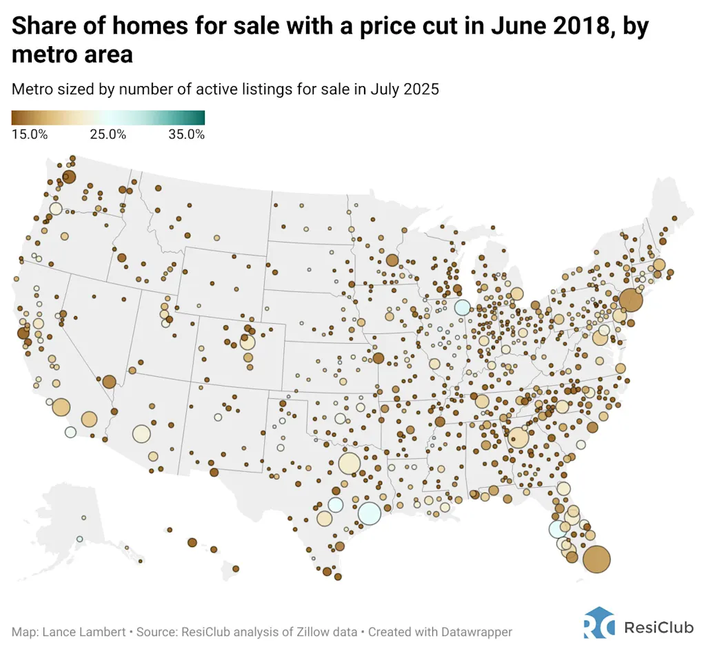
- June 2018 —> 18.1%
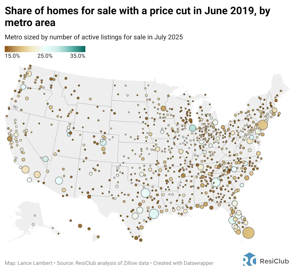
- June 2019 —> 20.1%
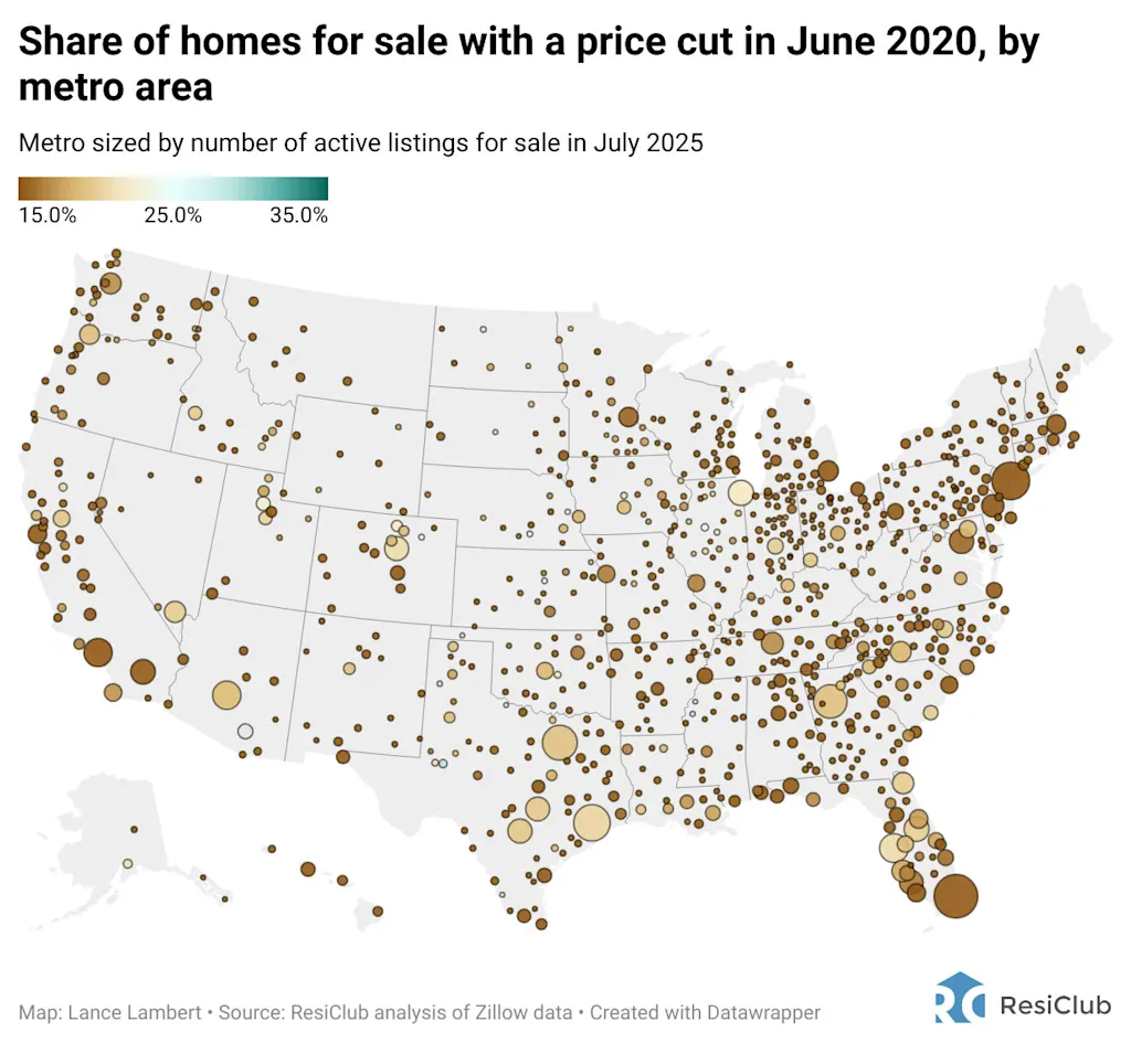
- June 2020 —> 14.8%
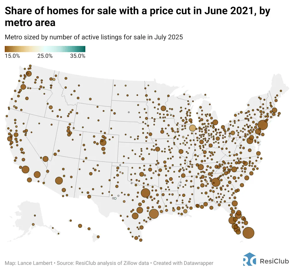
- June 2021 —> 11.4%
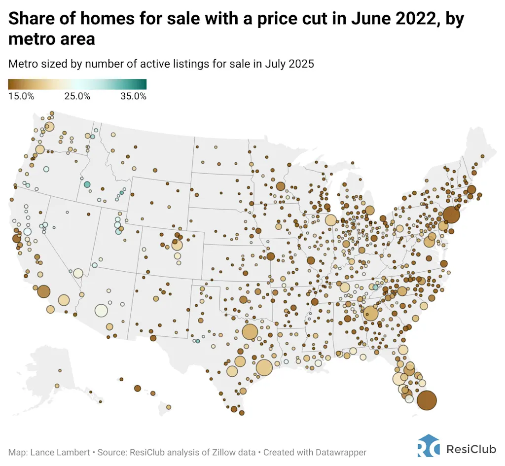
- June 2022 —> 17.2%
- June 2023 —> 19.1%
- June 2024 —> 23.5%
- June 2025 —> 25.6%
Click here to view a searchable/sortable table with data for more than 900 metropolitan and micro-area housing markets.
If you’re a ResiClub reader—especially a ResiClub PRO member—neither the softening nor the bifurcation should surprise you.
As ResiClub has well documented, many housing markets in the Northeast and Midwest have thus far had a milder and slower softening, while many areas in pandemic boom areas in the Mountain West and Sunbelt have seen a faster and greater softening in the post-boom market.
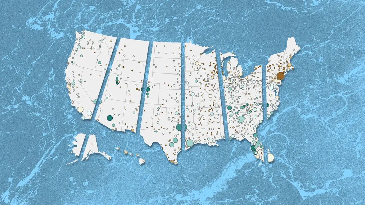
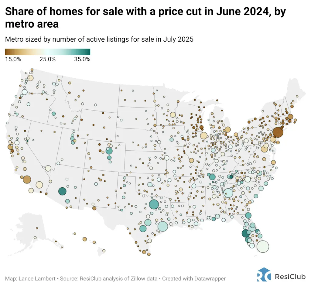
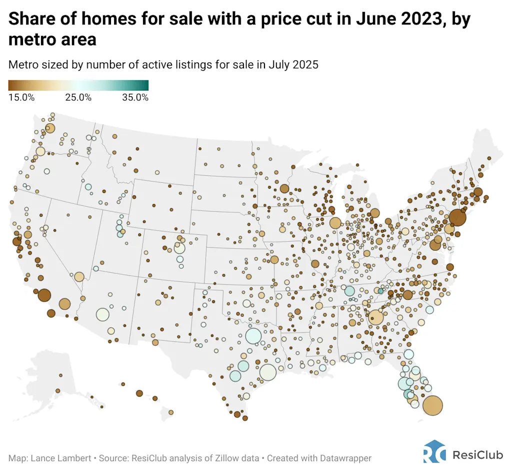
To help you better view the story, we’ve created a map showing the share of homes that saw a price cut in June for every year since 2018.
Below is June 2025 👇
Below is June 2024👇
Below is June 2023 👇
Below is June 2022 👇
Below is June 2021 👇
Below is June 2020 👇
Below is June 2019 👇
Below is June 2018 👇
According to Zillow: “Share of listings with a price cut: The number of unique properties with a list price at the end of the month that’s less than the list price at the beginning of the month, divided by the number of unique properties with an active listing at some point during the month.”
What's Your Reaction?
 Like
0
Like
0
 Dislike
0
Dislike
0
 Love
0
Love
0
 Funny
0
Funny
0
 Angry
0
Angry
0
 Sad
0
Sad
0
 Wow
0
Wow
0