


Lyft just got a new logo—can you spot the difference?
Lyft just got a new logo, but you probably didn’t notice it.
Over the past few weeks, Lyft has quietly rolled out an updated logo, broadened color palette, and custom typeface on its app and across its social media platforms. The new look, designed by the branding studio Koto, is meant to serve as a natural progression of the brand’s existing identity, injecting it with a subtle boost of structure and maturity.
According to Arthur Foliard, Executive Creative Director at Koto, the changes come at a “pivotal moment” for Lyft, which is currently testing out an expansion into autonomous driving and slowly gaining on its main competitor (and dominant industry player), Uber. In an interview with Fast Company this May, Lyft CEO David Risher noted that, since he joined Lyft in 2023, the company has brought its market share in the U.S. from 26% to 31%.
Lyft’s blink-and-you’ll-miss-it new look follows in a recent trend of larger brands, like Walmart and Adobe, skipping the “big rebrand” that ruled the branding world several years ago in favor of understated-yet-practical refreshes.![]()
Lyft’s new look
Looking at Lyft’s new identity next to its old is a bit like a game of spot the difference. But one key detail in the logo immediately jumps out: The playful path connecting the f and t characters has been severed.
“The Lyft logo is one of the most recognizable in tech, so we approached it with a lot of care,” Foliard says. “The original had a ton of character, but it wasn’t optimized for the way the brand shows up today, especially in smaller, digital contexts. The ligature between the ‘f’ and ‘t’ in particular caused legibility issues and sometimes felt overly stylized.”
To preserve the visual cues that make Lyft’s logo recognizable, Foliard’s team broke up the ligature but kept the spirit of the mark’s swooping, bold letters the same. Besides the newly separated f and t characters, the rest of the logo has been just slightly slimmed down and realigned.
“We adjusted the weight, spacing, and proportions to make the wordmark feel more confident and contemporary, less ornamental, more intentional,” Foliard says, adding, “The result is a logo that feels mature without being cold. It still has that signature Lyft charm, but now it holds up wherever it appears, from app icons to car decals to national campaigns.”
That focus on versatility was also applied to Lyft’s color palette and typography. “Lyft Pink,” the company’s signature shade of neon purplish-pink, has been given a more focused role. Whereas Lyft Pink was previously used more wholesale across the branding, Koto built out an accompanying palette of off-whites, deep pinks, and neutrals to keep the bright hue reserved for the most important moments of the brand, like the logo.
One feature of the branding that was entirely overhauled is its typography. Foliard says Lyft was previously using several functional typefaces that “while serviceable, didn’t quite capture Lyft’s warmth and humanity.” So, in collaboration with the type design studio NaN, Koto’s team created a custom typeface for Lyft called Rebel Sans. It’s a classic-looking sans serif, available in a range of weights, that echoes the logo with flourishes like a half-smile shape in the y character.
“We wanted it to feel like it had been made by people, for people,” Foliard says. “It features distinct humanist details—slight line weight variation, gentle curves, and subtle flares—that bring a sense of the human hand into both display and text. Underneath it all, it’s grounded in a more geometric structure, giving it the clarity and sophistication needed to scale across the brand.”![]()
Lyft gets the baby botox treatment
Lyft’s spruced up identity is the latest in a series of similar approaches from other major brands. If the early 2020s were the heyday of the major rebrand, and 2024 was the era of the dialed-back “brand refresh,” then 2025 is currently seeing an even more minimal wave of branding baby botox. This year, several brands have moved away from headline-grabbing overhauls in favor of small updates that are intended to fly under the radar.
For an ultra-recognizable brand like Walmart, this approach is meant to avoid alienating the customer by shedding too much core brand affinity at once. In January, Walmart introduced its biggest branding update in two decades—an update that, rather than actually replacing any assets, instead opted to simply spruce up the existing look with brighter colors and chunkier shapes.
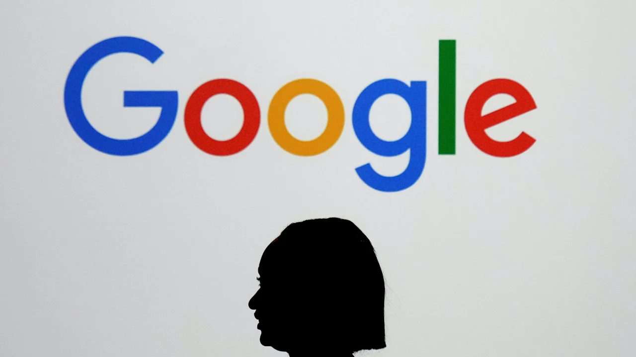
Other brands, like Amazon (which also worked with Koto on its logo touch-up) and Google, have similarly rolled out new logos in recent months that would likely require a trained eye to spot. In May, Mother Design studio, which gave Adobe’s logotype a subtle facelift, encapsulated this trend by explaining that its goal was to create an update that “looks as if it’s always been there.” For Lyft, Foliard says, this new branding “wasn’t about changing who Lyft is,” but rather about sharpening what was already there.
“The timing felt right to strike that balance between evolution and preservation, ensuring the brand could grow with the business while keeping the heart and humanity that made it iconic in the first place,” Foliard says.
What's Your Reaction?
 Like
0
Like
0
 Dislike
0
Dislike
0
 Love
0
Love
0
 Funny
0
Funny
0
 Angry
0
Angry
0
 Sad
0
Sad
0
 Wow
0
Wow
0