


![Annie Tracy shares "Catching Feelings" off of impressive debut EP [Video]](https://earmilk.com/wp-content/uploads/2025/06/P1_Bryce-Glenn-1-800x458.jpg)


The anatomy of Zohran Mamdani’s winning campaign poster
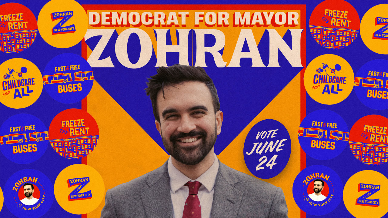
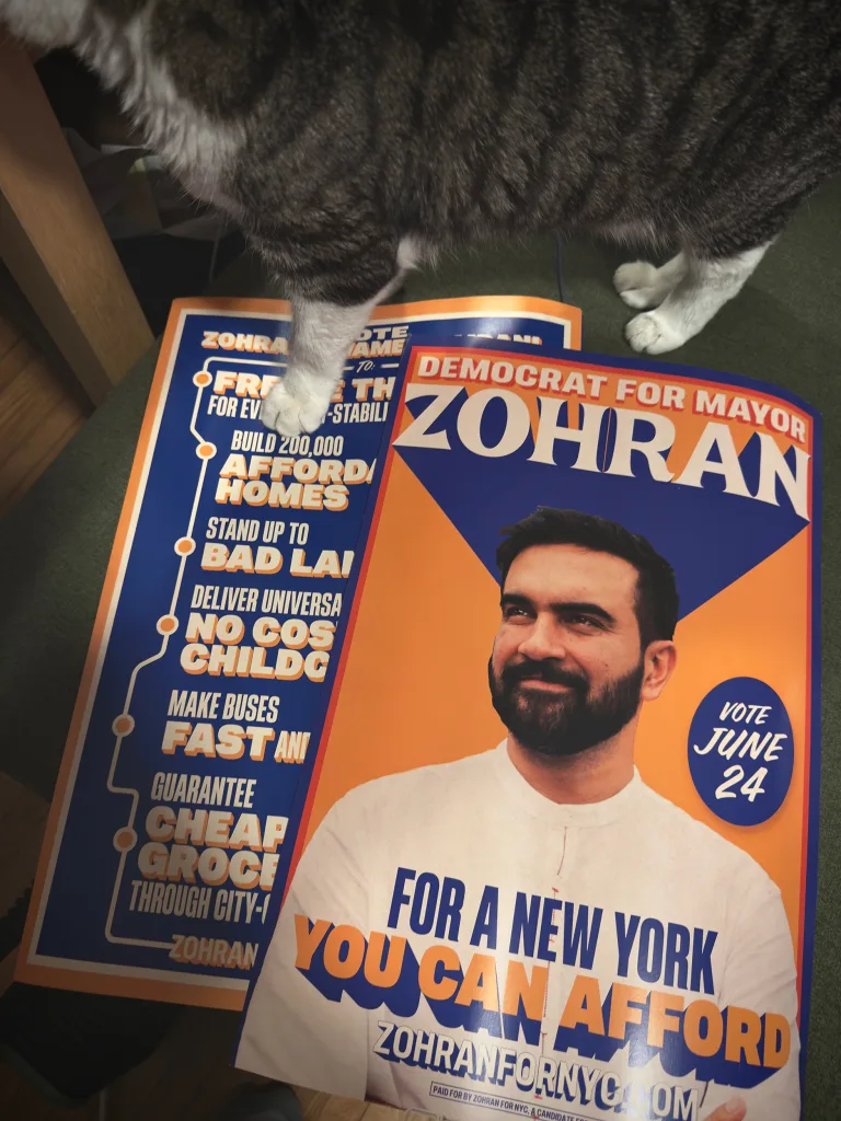
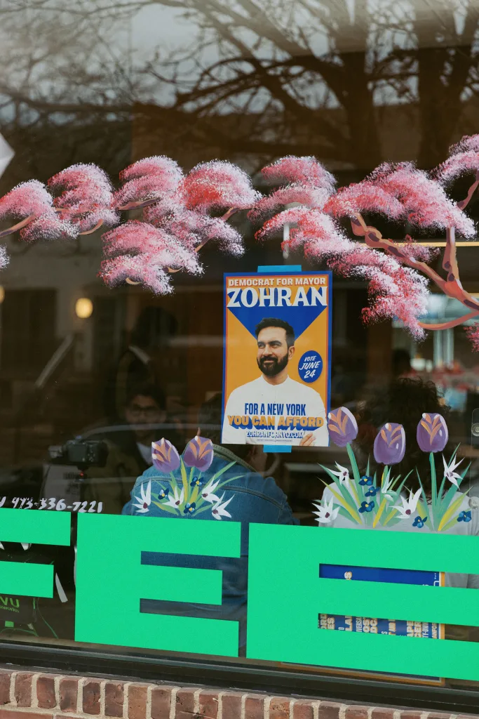
There isn’t a single element that carried Zohran Mamdani’s campaign—except, well, for Mamdani himself. However, there was one campaign artifact that became ubiquitous on New York City streets in the months ahead of the mayoral primary: his campaign poster. Taped up on storefronts, in apartment windows, and around light posts, it was impossible to miss. The mix of colors (Metrocard yellow, Mets blue, and fire-engine red); Mamdani’s affable portrait; and a hand-drawn wordmark with an exaggerated drop shadow that alighted his head like a crown stood out in the cacophonous cityscape (and bland arena of the competition’s branding). Could a single-term assemblyperson ascend to the highest political office in the United States’ most-populous city? The poster sure made it easy to envision.
Mamdani’s aesthetics, from his fashion to his video filters, are a master class in the communication required for a 21st-century campaign to be successful. His branding, by the Philadelphia-based design cooperative Forge, was nimbly applied to social media, mailers, and merch and brought cohesion to the multi-platform campaign without veering into corporate territory. And for all the new media associated with Mamdani, his poster, one of the oldest tools in a candidate’s kit, encapsulated the innovative messaging at the heart of his campaign: It was fresh, welcoming, and specific—and set a new gold standard for progressive, political design.
The poster was designed by Tyler Evans, a designer based outside of Washington, D.C., who was Bernie Sanders’s design director and, as of three months ago, became Alexandria Ocasio-Cortez’s creative director, and was the first widely circulated printed matter rooted in the visual identity that Forge created for the campaign. We spoke to Evans and Aneesh Bhoopathy, a creative at Forge, about what makes Mamdani’s poster design so compelling.
Rooted In New York
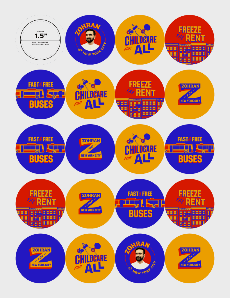
The poster is based on the design system Bhoopathy and the team at Forge created. The identity is “grounded in New York’s iconography and typographic legacy,” Bhoopathy says, and features a primary color palette that pulls from Metrocards, taxi cabs, and “even the New York Lottery logo.”
While design systems trace their roots to corporate branding, Mamdani’s avoids feeling contrived or stiff. Bhoopathy hand-drew Mamdani’s wordmark, a nostalgic nod to the once-ubiquitous hand-painted signs that adorned bodega storefronts, and specified Unique Gothic, a sans-serif typeface, for all other text as a way to “balance out the playfulness so the identity doesn’t get too Barnum and Bailey,” he says. The colors, lettering, and levity help Mamdani’s branding feel relatable. “The nostalgia, the human touch—that is obviously different from a more corporate brand,” Bhoopathy says. “It’s just the feeling of it being for everyone.”

A Handmade Look
Before designing Mamdani’s mayoral campaign, Bhoopathy designed graphics for his assembly run and has also worked with New York State Senators Julia Salazar and Jabari Brisport. These experiences taught him that the branding for progressive candidates is often memed—like the famous Hot Girls for Zohran shirts—which he welcomes.
“One thing about working in leftist campaigns is knowing that people are going to remix, screen print, and make their own things,” Bhoopathy says. “And so you have to be comfortable with letting things take on a life of their own and not feel too precious about it, like you might be with a corporate brand.”
A human touch is also important to Evans in poster design. “In Democratic politics especially, there was a rush to kind of put a corporate sheen on things and to make things really nice and clean,” he says. “And it kind of forgets the fact that people are involved and people are messy. I don’t think people should be afraid of making things look a little rough, making things look handmade, or potentially even doing things handmade. The people element of politics can’t be overlooked, and that follows through into visuals.”
The campaign poster was the first project to test Forge’s flexible approach to the design system. The only constraints? Evans was asked to use a portrait Mamdani’s team provided and to stick to the typefaces that Bhoopathy specified; everything else was open to interpretation.
Not a Political Type
Evans designs political posters that don’t look political. It’s a strategic move: the voters his candidates are vying for are distrustful of establishment politics. “Usually this draws people in and makes them curious about what this person is about,” Evans says.
In order to do this, Evans opts for expressive typography. “There’s always got to be some mood, energy, and spirit present,” he says. “It has to feel alive.”
The sensibility Evans likes is common in the sports and entertainment industry and, occasionally, in political design from the past, especially from the FDR and Lyndon B. Johnson eras. Baseball logos are frequent reference material; he used the Gothic font from the Pittsburgh Pirates in an Instagram poster for one of Bernie’s rallies in the Steel City; in an Instagram poster he designed to announce Bernie’s endorsement of Mamdani, he borrowed from the Brooklyn Dodgers logo for Sanders’s name and from the Mets logo for Mamdani. (In addition to designing the printed campaign poster, Evans also designed multiple Instagram posters for the campaign’s pivotal moments.)
The wordmark Bhoopathy designed has the gravitas Evans looks for. Evans riffed on the drop shadows found in Bollywood posters so it stands out even more. “Somebody on the AOC campaign said [Zohran’s poster] looked more like a concert poster for a singer than a political campaign poster, which I take as a compliment,” he says.
Brevity, for Legibility’s Sake
There is very little writing on Mamdani’s poster and what words are there are efficient. They say exactly what he is running for and what his campaign platform is: “A New York You Can Afford.” And once the poster earns that attention, it’s respectful of it by being clear with what it says—no vague proclamations of “Hope,” which might have worked in Shepard Fairey’s 2008 poster for Obama, but isn’t enough today. “Thinking of people walking by on foot, you have probably two seconds max for people’s attention,” Evans says.
Editing down the copy to the right amount was trial and error. Originally, the campaign wanted Mamdani’s full name on the poster, but Evans eventually pared it back to “Zohran.” Additionally, when Evans began working on the poster, the campaign hadn’t finalized its tagline; the working copy was “Afford to Live and Afford to Dream,” a phrase that appeared on a banner behind Mamdani when he gave his election night speech.
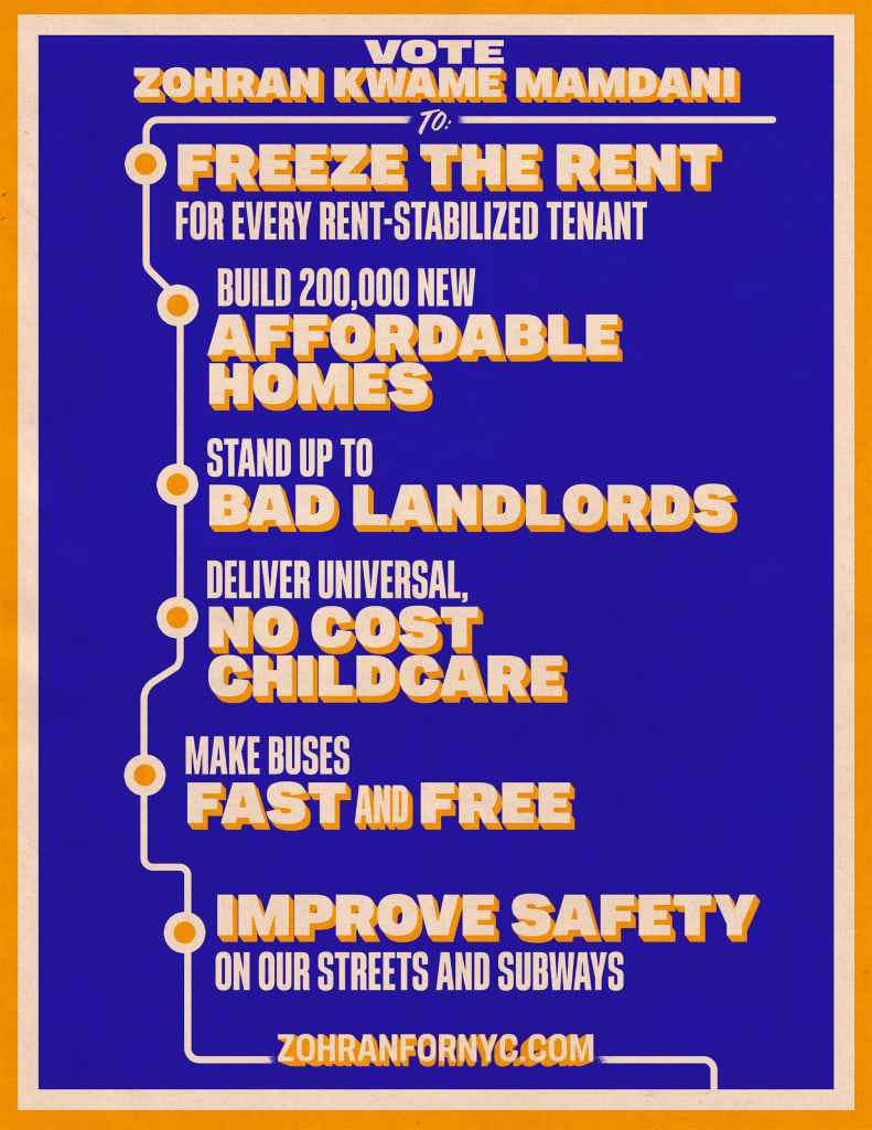
The back of the poster features Mamdani’s platform: building affordable homes, making buses fast and free, and a rent freeze for all stabilized tenants. “This campaign is uniquely disciplined and sharp,” Bhoopathy says of the messaging.
In March, the campaign released a new version of the poster on Instagram, which was even more pared back.
Brief phrases also help with another key aspect of Mamdani’s campaign: it’s multilingual. Mamdani frequently spoke to constituents in Spanish and filmed videos in Urdu/Hindi. His printed material was translated into 14 languages, some that are written in characters and some that are read right to left. The need to be nimble influenced the identity Forge designed and the poster Evans designed. Keeping the copy “short and sweet lends itself to translations,” Evans says.
A Design Fit for the Candidate
But most importantly, the campaign’s design fit Mamdani. No matter how “good” a visual identity might be, if it isn’t authentic to the candidate, it just won’t work. “The candidate matters,” Bhoopathy says. And Evans echoes a similar sentiment. “Not to oversimplify it, but 95% is him.”
To wit: Dianne Morales, a candidate for mayor in 2021, had distinctive gradient-inspired branding (and inventive merch), but her campaign spectacularly flopped after her staffers protested against poor working conditions. If you can’t manage your campaign, it doesn’t bode well for managing a city. Meanwhile, the branding for Kamala Harris’s 2020 presidential campaign nodded back to Shirley Chisholm’s historic run for the country’s top office, but her “For the People” slogan was impotent against the chorus of “Copmala” memes.
Meanwhile, Mamdani understood how important branding is and had strong personal opinions about what his should look like. “I admire his attention to detail, his belief in the power of design to communicate ideas, and his willingness to get creative with it,” Bhoopathy says.
What's Your Reaction?
 Like
0
Like
0
 Dislike
0
Dislike
0
 Love
0
Love
0
 Funny
0
Funny
0
 Angry
0
Angry
0
 Sad
0
Sad
0
 Wow
0
Wow
0