


Google just changed its ‘G’ logo
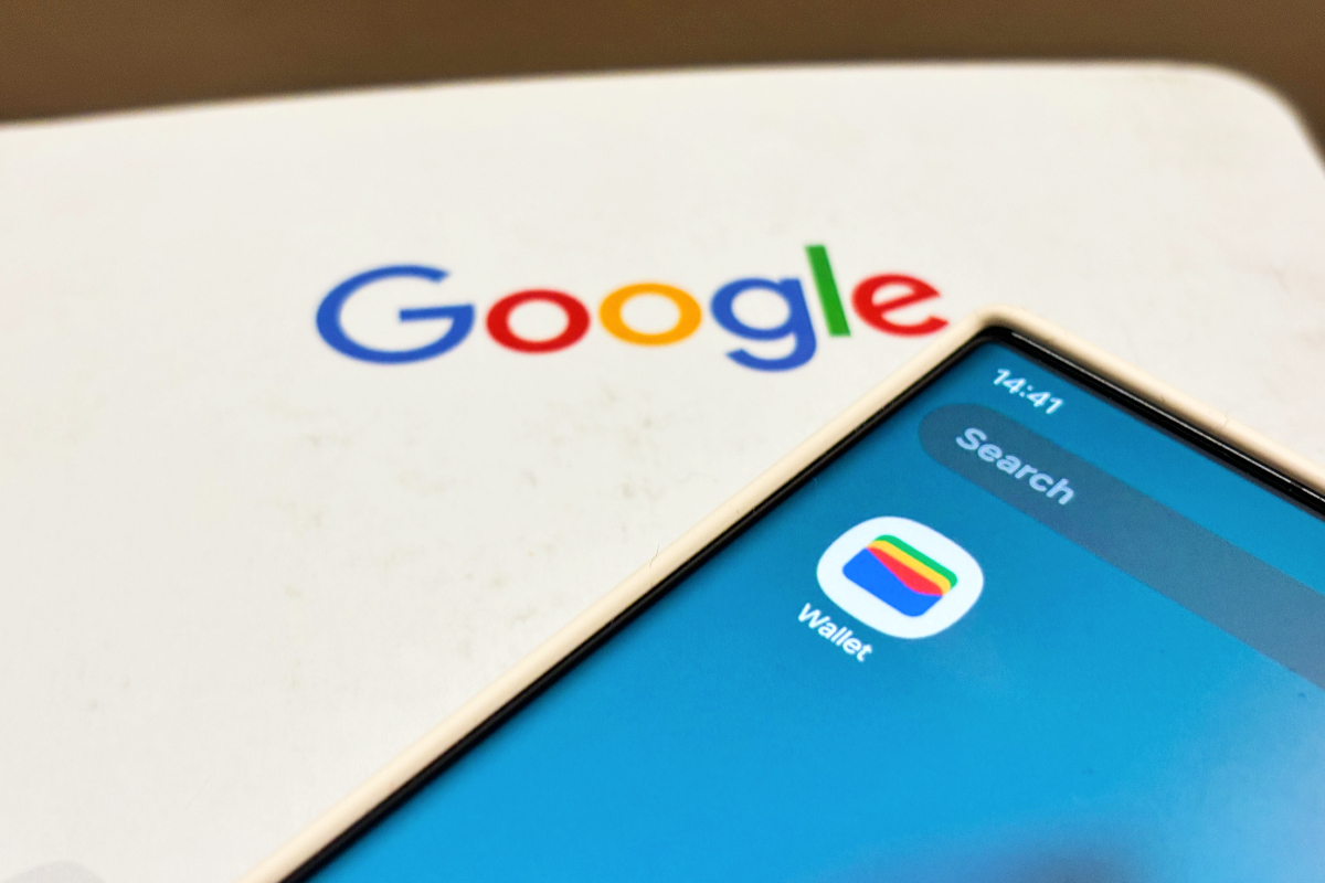
Google has updated its colorful “G” logo for the first time in almost a decade. An update to the Google app on iOS shows a new logo that blends the logo’s red, yellow, green, and blue colors into a gradient, as reported by 9to5Google.
Google last made a major change to its logo in September 2015, when the company updated its font to a sans-serif typeface. At the time, Google also revealed a new “G” logo that incorporates all of the brand’s colors.
Though this change may be a bit more subtle, the newly blended logo brings it in line with the gradient it uses for the Gemini logo’s design.
So far, it appears Google has only updated its logo on its iOS app. The “G” still appears with distinct borders between colors on Android and the web. Google didn’t immediately reply to a request for comment from The Verge.
What's Your Reaction?
 Like
0
Like
0
 Dislike
0
Dislike
0
 Love
0
Love
0
 Funny
0
Funny
0
 Angry
0
Angry
0
 Sad
0
Sad
0
 Wow
0
Wow
0