It’s one of the most valuable companies in the world, and its logo is baffling
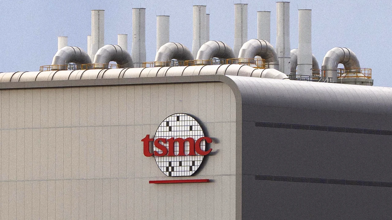
Although less familiar than many of its tech rivals, Taiwan Semiconductor Manufacturing Company (TSMC) is kind of a big deal. Its valuation, north of $1 trillion, ranks the chipmaker ninth globally among publicly held companies, and its strategic significance in the silicon arms race led New York Times columnist Nicholas Kristof to label it “the most important company in the world.”
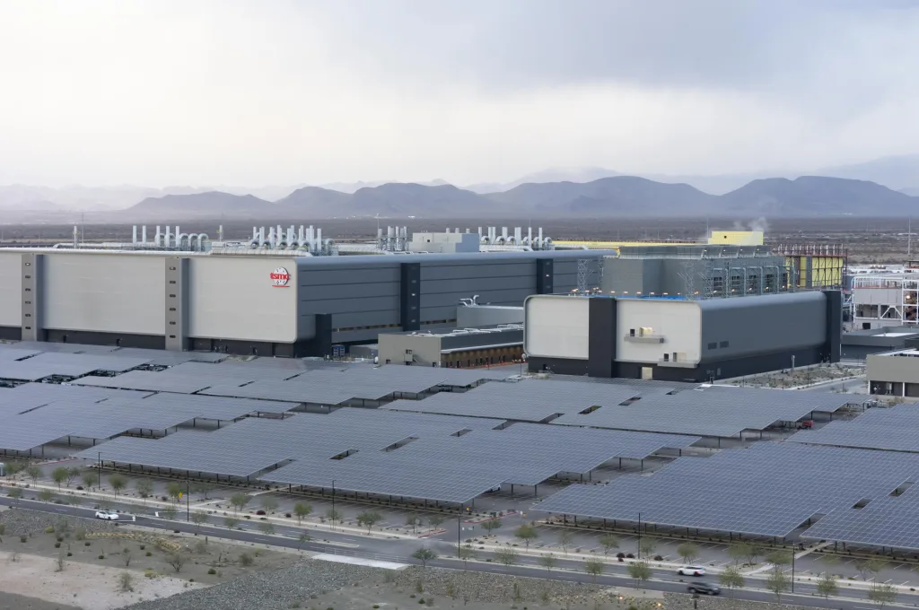
So when TSMC’s massive new manufacturing plant (or “fab,” as those in the semiconductor business like to call it) arose recently in the desert north of Phoenix, Arizonans might have expected to see a polished logo adorning the building’s facade. Instead, many were likely flummoxed by the TSMC symbol. Was it supposed to be a crossword puzzle? A disco ball? A badminton racquet? A screen door replete with dead houseflies?
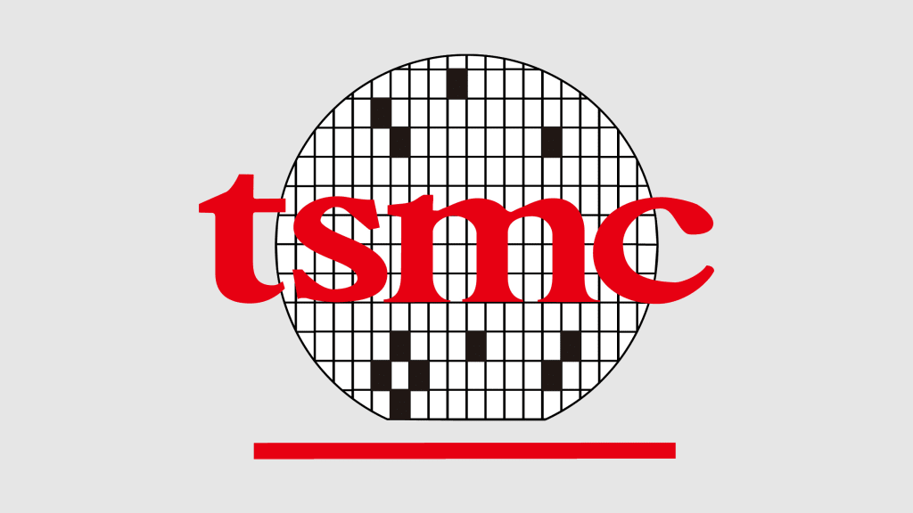
In fact, the logo, which debuted in 1988, one year after the company’s founding, represents “a stylized semiconductor wafer design,” as a TSMC trademark application puts it. A wafer is a thin, circular slice of silicon which is cut into rectangular “dies” that are used to make computer chips. The flat section of the wafer, visible at the bottom of the TSMC logo, is called, well, a “flat” and is used for orientation in the manufacturing process.
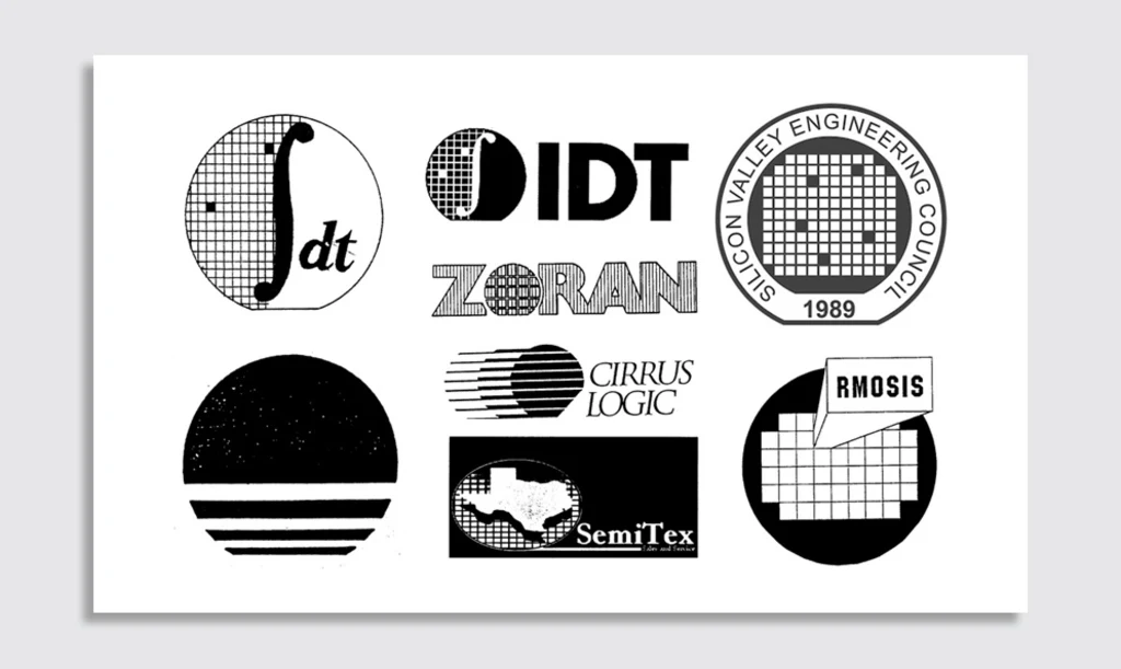
The black rectangles in the logo seem to represent defective dies as they would appear on a wafer map, a diagram outlining the usable sections of the silicon disc. One might find this an odd design element to include, but it appears to have been a bit of a convention among ’80s wafer logos. San Jose semiconductor maker Integrated Device Technology’s 1981 logo featured two such defective dies. When it reversed the coloring of its logo in the ’90s, did it realize the resulting implication was that an overwhelming majority of its dies were duds?
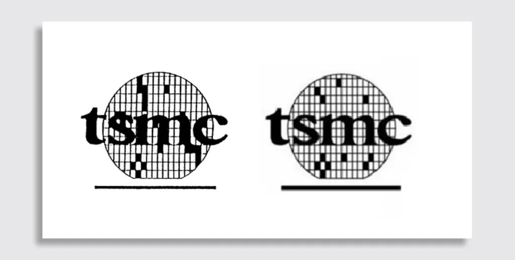
TSMC took the opposite tack, slightly revising its mark in 2001 to reduce the number of those troublesome black rectangles while improving legibility. Otherwise, though, the logo has remained unchanged and, frankly, it doesn’t work well in 2025. Not only is the wafer symbolism inscrutable to the modern eye, but by today’s standards, its design is overwrought, amateurish, and dated, in keeping with an overall company brand that’s as dry as soda crackers.
Beyond employing the most obvious graphic design solution of adopting the company’s product as a logo, the firm has named itself using the largely-abandoned tactic of simple descriptiveness, which, if still in vogue, might have resulted in Apple being known as the Northern California Computer Company or Amazon going by Seattle Online Bookstore, Inc.
Until recently, this may not have been seen as a problem for companies that, like TSMC, were not public-facing. There was a sense that branding elements like names and logos were shiny baubles that served only to catch the eyes of the public, and that were irrelevant within the context of B2B relationships. As economic historian Mira Wilkins put it in a 1992 paper, “Most industrial organization economists consider the brand name as highly important in sales to the final consumer. They take the view, however, that profit-motivated firms are wiser than individuals, so trade marks are not needed to convey information to producers.”
Such thinking is going by the wayside as modern economists let go of long-held assumptions about perfect human rationality, and it would seem time for even the stodgiest B2B companies to start caring more about their brands. TSMC, in particular, has been embroiled in geopolitical intrigue that has put it in an unprecedented spotlight. The face that it presents to the world matters more than it ever has, and it’s about time for TSMC to sunset its old wafer.
What's Your Reaction?
 Like
0
 Dislike
0
 Love
0
 Funny
0
 Angry
0
 Sad
0
Sad
0
 Wow
0
Wow
0


