


Shimmers, floating toolbars, and radical transparency: Here’s what iOS 26 could look like
In less than two weeks, on June 9, Apple will kick off its annual Worldwide Developers Conference (WWDC), in which it will showcase the next versions of the operating systems that power its myriad devices. The centerpiece of that event will be iOS 26, the soon-to-be renumbered operating system that powers the company’s flagship product, the iPhone.
Yet, despite artificial intelligence being all the rage in the tech industry right now, reports say that with iOS 26 (formerly referred to as iOS 19—see below), Apple will promote something visual instead of artificial. While some new AI features may be baked into the newly renumbered OS, the key feature of iOS 26 will be its complete visual redesign. In other words, your iPhone’s software is about to look strikingly different. Here’s how.
Welcome to the solarium—and iOS 26
Two big changes are coming to the next iOS. The first is a naming rebrand. Historically, iOS versions were numbered sequentially, starting with “iPhone OS 1” for the original iPhone in 2007. With the iPhone’s 2010 operating system—its fourth version—Apple shortened the name to “iOS 4.”
However, Bloomberg reports that starting with the new iOS Apple will debut on June 9, the company will drop the sequential numbering of the operating system, and go with the year it will spill over into, just like carmakers do with vehicles. So, despite being the 19th version, the upcoming iOS will no longer be called “iOS 19” and will instead be called “iOS 26.” This change will be carried over to the numbering system on all of Apple’s other operating systems, too, and is reportedly being done to provide a more uniform numbering scheme for its various software products (currently numbered macOS 16, iPadOS 18, and visionOS 2, etc), and make it easier for consumers to identify if they are running the latest device software.
However, the rebranded iOS naming scheme is a relatively minor change compared to what else Apple has in store for iOS 19—sorry, iOS 26. That change is a radical visual redesign of the operating system.
Most of what is currently known about iOS 26’s visual overhaul comes from two sources: Bloomberg’s Mark Gurman and Jon Prosser, host of the Front Page Tech YouTube channel. Both have reported on iOS 26’s major redesign, and their reports largely align, suggesting that they are, at least in part, accurate.
So what will iOS 26 look like? Its internal codename—something Apple assigns to every software product in development—gives us a big clue. That name is “solarium,” Bloomberg reported. If you’re wondering what a solarium is, know that you’ve probably stood in one if you’ve ever been to an interior garden. It’s a room fitted with glass walls and ceilings, designed to let as much sunlight as possible filter in.
Apple presumably chose the “solarium” codename for iOS 26 because the entire operating system will have a glass-like appearance. By “glass-like,” think of an operating system with elements like menus and toolbars that are partially transparent—you can see through them, and the colors and shapes of content behind them will show through, just like light shows through a solarium’s glass walls.
If this sounds vaguely familiar to you, it’s because Apple has actually used similar transparency in one of its operating systems before—visionOS, the software that powers the Apple Vision Pro. Indeed, reports suggest that iOS 19’s design is inspired by visionOS. But visionOS powers a spatial computing device—one that melds the physical world with the digital. That 3D interface relies heavily on digital drop shadows and other visual tricks to re-create the feeling of physical depth. However, an iPhone’s operating system runs on a 2D screen, so don’t expect iOS 26 to feature heavy digital dropshadows.
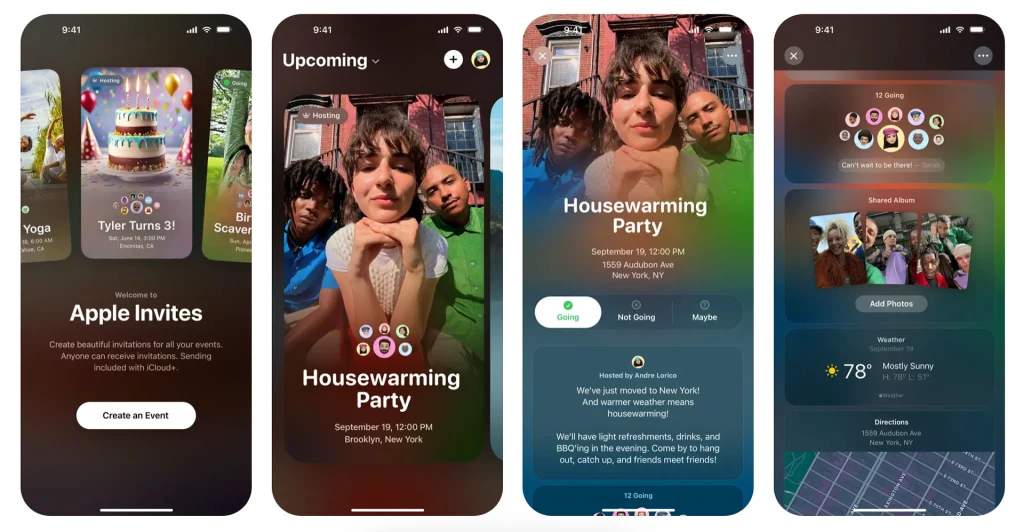
If you want to see how Apple will handle transparent elements on a 2D device, you don’t have to wait until June 9. Instead, simply check out Apple’s new Invites app, which it launched in February. You can see a screenshot of it above. See how different the UI looks in the app from the UI of iOS 18 currently? Those glassy panes in the app give the best visual hint of what to expect system-wide in iOS 26.
Another reported feature of the redesign is reflective buttons and other elements that shimmer when you move your phone. This shimmering isn’t caused by real light hitting your iPhone’s screen. Rather, the software can tell, thanks to your iPhone’s gyroscope, when the device is moving and tilting in your hand, and will thus generate a reflective light effect across buttons to give the translucent objects more depth and form.
It will probably be very similar to how the home screen icons in tvOS, the operating system that powers the Apple TV, appear to shimmer when you gently swipe them with your thumb using the Siri Remote’s touchpad.
iOS 26 is also expected to gain other major visual changes, including floating pill-shaped toolbars (replacing the fixed toolbars used at the bottom of iPhone apps now), thinner buttons, a glass-like keyboard, and potentially even rounder app icons.
What’s behind the iOS 26 visual shakeup?
Those who have reportedly seen builds of iOS 26 say the redesign that Apple is set to unveil in less than two weeks represents the most significant visual overhaul to the iPhone’s operating system since iOS 7 in 2013—a design that has largely persisted through and to the current iOS 18.
Indeed, Bloomberg’s Mark Gurman has called the redesign transformative, stating that it is “one of the most dramatic software overhauls in the company’s history” while noting that it “will fundamentally change” the look of iOS.
But here’s one thing about change: most people hate it—or are at least apprehensive about it. And Apple has a lot of people to contend with. It has more than two billion active devices around the world, used by hundreds of millions of users, and the switch isn’t coming to just the iPhone’s operating system, but to the operating systems of all of Apple’s devices this fall, including the iPad’s iPadOS, the Mac’s macOS, the Apple Watch’s watchOS, the Apple TV’s tvOS, and the Vision Pro’s visionOS (all renumbered to “26,” too).
But Apple reportedly feels it needs to deliver something this year with iOS and its other operating systems that is, quite literally, eye-catching. It needs something special to help reinvigorate device sales, particularly after the flagship feature of iOS 18, Apple Intelligence, has largely been met with indifference by the average consumer and disappointment by AI aficionados.
In January, respected TF International Securities analyst Ming-Chi Kuo stated that there was no evidence to suggest that Apple Intelligence was driving hardware upgrade cycles among consumers. In Apple’s most recent financial report, from its second quarter, iPhone revenue rose about 2% from the same period a year earlier, to $46.8 billion, but that growth may have been driven by U.S. consumers snapping up the device before Trump’s tariffs make iPhones more costly, notes Sherwood.
Putting a new digital coat of paint on iOS 26 and the company’s other new operating systems is an easy way to make its devices feel fresh again—and, if done right, it can go a long way to actually making the ever-increasingly complicated operating systems more straightforward to use and easier to navigate.
By incorporating the same design language used in iOS 26 into its other products, the redesigned interface may make users feel more familiar with Apple’s other devices, which could help spur sales of Macs or Apple TVs to people who currently only own iPhones.
The iOS 26 redesign may also help distract from the fact that Apple isn’t expected to make any significant announcements regarding its AI platform, Apple Intelligence, at WWDC.
Despite the early reports about iOS 26’s visual changes, we won’t know anything for sure until Apple unveils a preview of the upcoming operating system at WWDC on June 9.
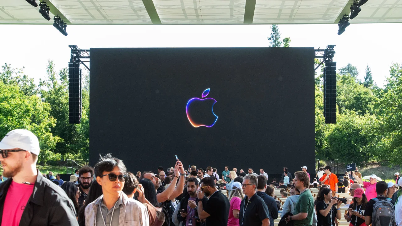
Speaking of that event: Apple’s logo for WWDC25 may be teasing the iOS 26 redesign in plain sight. If you check out the animated logo here, you’ll notice that the ends of the transparent, glass-like rainbow seem to show colored light reflecting through its surface—just like you’d see at a solarium.
What's Your Reaction?
 Like
0
Like
0
 Dislike
0
Dislike
0
 Love
0
Love
0
 Funny
0
Funny
0
 Angry
0
Angry
0
 Sad
0
Sad
0
 Wow
0
Wow
0