


The housing market is shifting—here’s where it’s happening most rapidly

Want more housing market stories from Lance Lambert’s ResiClub in your inbox? Subscribe to the ResiClub newsletter.
A few days after I launched ResiClub in October 2023, I wrote an article titled “The key housing market metric heading into 2024.” In it, I reaffirmed a point I had also made at Fortune in 2022: that some traditional rules of thumb—i.e., months-of-supply thresholds for what constitutes a buyers’ market versus a sellers’ market—could struggle in this post–Pandemic Housing Boom environment, where there’s downward pressure on prices.
For the time being, I suggested that an easy-to-create and useful metric for housing stakeholders to follow—one that helps gauge short-term pricing momentum and whether downside risk might manifest—is a local market’s level of active inventory compared to that same market’s inventory level in the same month of pre-pandemic 2019.
The thinking was that markets where active inventory remains well below 2019 levels would still exhibit some tightness, while those where inventory has surged back to or above pre-pandemic 2019 levels would experience a shift in the supply-demand equilibrium more in favor of homebuyers.
Heading into 2025, I recreated that analysis showing the dynamic was still holding true.
Fast-forward to today, and this particular data cut still proves useful (overtime ResiClub believes its usefulness will diminish—just not right now).
Generally speaking, housing markets where active housing inventory for sale has surged above pre-pandemic 2019 levels have experienced weaker or softer home price growth (or even outright home price declines) over the past 36 months. Conversely, housing markets where active housing inventory for sale remains far below pre-pandemic 2019 levels have, generally speaking, experienced more resilient home price growth over the past 36 months.
Indeed, just look at the scatter plot below showing “Shift in home prices since their local 2022 peak” Vs. “active inventory for sale now compared to the same month in 2019” for the nation’s 250 largest metro area housing markets.
Below is the same scatter plot as the one above, only its color scheme is adjusted to show which markets have LESS active inventory now than in 2019 (BROWN) and which markets have MORE active inventory right now than in 2019 (GREEN).
Click here for an interactive version of the scatter plot below.
To see if this data cut still proves useful, let’s swap out “home price since their local 2022 peak” for “year-over-year home price shift.”
The answer is yes—the trend still holds. (Recently, both the Wall Street Journal and John Burns Research and Consulting created their own versions of this longtime ResiClub scatter plot.)
Below is the same scatter plot as the one above, only its color scheme is adjusted to show which markets have LESS active inventory now than in 2019 (BROWN) and which markets have MORE active inventory right now than in 2019 (GREEN).
The current regional bifurcation—greater weakness in Sun Belt and Mountain West boomtowns and greater resiliency in the Northeast and Midwest—shouldn’t be surprising to ResiClub readers. Given that we cover that regional bifurcation frequently, we’re not going to spend time in this piece discussing what’s driving that bifurcation.
Instead, let’s discuss why this particular data cut is useful right now, and why overtime it could become less useful.
This data cut’s usefulness—right now—explained
During the Pandemic Housing Boom, housing demand surged rapidly amid ultralow interest rates, stimulus, and the remote work boom—which increased demand for space and unlocked “WFH arbitrage” as high earners were able to keep their income from a job in, say, NYC or L.A., and buy in, say, Austin or Tampa. Federal Reserve researchers estimate “new construction would have had to increase by roughly 300% to absorb the pandemic-era surge in demand.”
Unlike housing demand, housing stock supply isn’t as elastic and can’t ramp up as quickly. As a result, the heightened pandemic era demand drained the market of active inventory and overheated home prices, with U.S. home prices rising a staggering +43.2% between March 2020 and June 2022.
At the height of the Pandemic Housing Boom in spring 2022, most of the country had 60% to 75% less active inventory than in 2019. Once mortgage rates spiked, national housing demand cooled off.
While many commentators view active inventory and months of supply simply as measures of “supply,” ResiClub sees them more as proxies for the supply-demand equilibrium. Large swings in active inventory or months of supply are usually driven by shifts in housing demand. For example, during the Pandemic Housing Boom, surging demand caused homes to sell faster—pushing active inventory down, even as new listings remained steady.
Conversely, in recent years, weakening demand has led to slower sales, causing active inventory to rise in many markets—even as new listings fell below trend.
For a market like Austin or Punta Gorda to surge from historically low active inventory levels in spring 2022 to now well above pre-pandemic 2019 levels, it has taken a significant shift in the balance of power—from sellers to buyers.
That shift has also coincided with those markets experiencing outright home price corrections. Conversely, despite the affordability shock, markets like Syracuse and Milwaukee still have active inventory levels well below 2019 levels and continue to see slightly positive year-over-year home price growth.
Inventory wasn’t historically “high” back in 2019—so why does climbing back to 2019 levels matter?
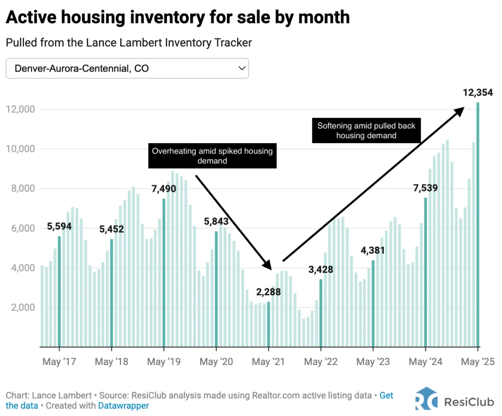
During the Pandemic Housing Boom, housing demand overwhelmed the Denver metro housing market—pushing active housing inventory for sale down to just 2,288 homes by May 2021, down 69% from the 7,490 listings in May 2019.
Since the Pandemic Housing Boom fizzled out, and mortgage rates spiked, active inventory for sale in Denver has spiked up to 12,354 active listings as of May 2025—65% above pre-pandemic May 2019 levels.
While active inventory for sale in Denver today isn’t necessarily that high by historical comparison, the sharp jump from 2022 inventory levels to 2025 levels in such a short window reflects a pretty big shift in the supply-demand equilibrium. On the ground that shift should feel jarring.
That greater active inventory bounce up in Denver has coincided with a greater house price softening/weakening. Indeed, Denver metro area home prices as measured by ResiClub analysis of the Zillow Home Value Index are down 1.7% year-over-year, and down 7.3% since their 2022 peak.
Why, over time, this data cut could prove less useful
One of the common pushbacks I hear when comparing today’s active inventory for sale to 2019 levels is that some markets—like Austin and Punta Gorda—have larger populations now than they did back in 2019.
It’s true that some of the markets with higher inventory today compared to 2019 are also the ones that have experienced notable population growth in recent years. However, that actual population growth—i.e., a larger population base—isn’t the sole reason inventory has jumped so quickly in places like Austin and Punta Gorda. Rather, it’s because those markets have experienced a sharper weakening in their for-sale market since the Pandemic Housing Boom fizzled out. And that has helped push up unsold inventory in those markets.
That said, over time, changes in market size—specifically population and total households—will naturally affect what constitutes a “normal” level of active inventory. By 2035, for example, comparing active inventory to 2019 levels will be far less meaningful than it has been in 2021-2025.
Some traditional rules of thumb have fallen short this cycle
A rule of thumb in real estate is that anything below a six-month supply of inventory is considered a “seller’s market,” while anything above a six-month supply is a “buyer’s market.” However, that hasn’t always held true this cycle, and ResiClub’s view is that this rule of thumb is a bit outdated.
In many housing markets, including Austin’s metro area, where house prices began to decline in June 2022 with only 2.1 months of inventory, that rule hasn’t applied effectively. In fact, even though Austin’s inventory only peaked at 5.2 months as of April 2025, according to Texas A&M University’s Texas Real Estate Research Center, home prices in the Austin metro have already fallen 22.8% from their 2022 peak, based on our analysis of the Zillow Home Value Index.
A better measure of this incoming pricing weakness was the abrupt active inventory jump that occurred in Austin in spring/summer 2022 (going from 0.4 months of inventory in February 2022 to 2.1 in June 2022), which quickly pushed active listings near/above pre-pandemic 2019 levels.
Big picture: In today’s post-Pandemic Housing Boom landscape, comparing a market’s current level of active inventory to its same-month 2019 baseline remains a useful gauge for the shift in the supply-demand balance.
While imperfect, this simple metric captures the degree of tightness or softening better than some traditional measures. Markets where inventory has surged well above 2019 levels—like Austin or Punta Gorda—are typically the ones that have seen demand weaken most, restoring buyer leverage and, in some cases, producing home price corrections. Meanwhile, markets where inventory remains far below 2019 levels continue to exhibit greater pricing resiliency.
This article is an exclusive look at a ResClub PRO research article that was originally published on June 10th.
What's Your Reaction?
 Like
0
Like
0
 Dislike
0
Dislike
0
 Love
0
Love
0
 Funny
0
Funny
0
 Angry
0
Angry
0
 Sad
0
Sad
0
 Wow
0
Wow
0