


![Star2's "4:00 AM in LA” is a midnight meditation on heartbreak [Video]](https://earmilk.com/wp-content/uploads/2025/06/Star2-4am-800x627.jpg)


Apple’s Liquid Glass is exactly as ambitious as Apple
Apple is calling it the biggest redesign in history. Starting this fall, iOS, MacOS, iPadOS, and WatchOS will all be unified under a single design paradigm for the first time: What Apple is calling Liquid Glass.
Introduced this week at the Worldwide Developers Conference (WWDC), Liquid Glass is a highly articulated reskin of iOS and its other software, intentionally launching with feature parity to not rock the boat and leaving hundreds of millions of customers unsure of how to use their phones. In the future, it’s more of a question mark. It’s a UX framework that can be exactly as ambitious as Apple chooses to be.
What is Liquid Glass?
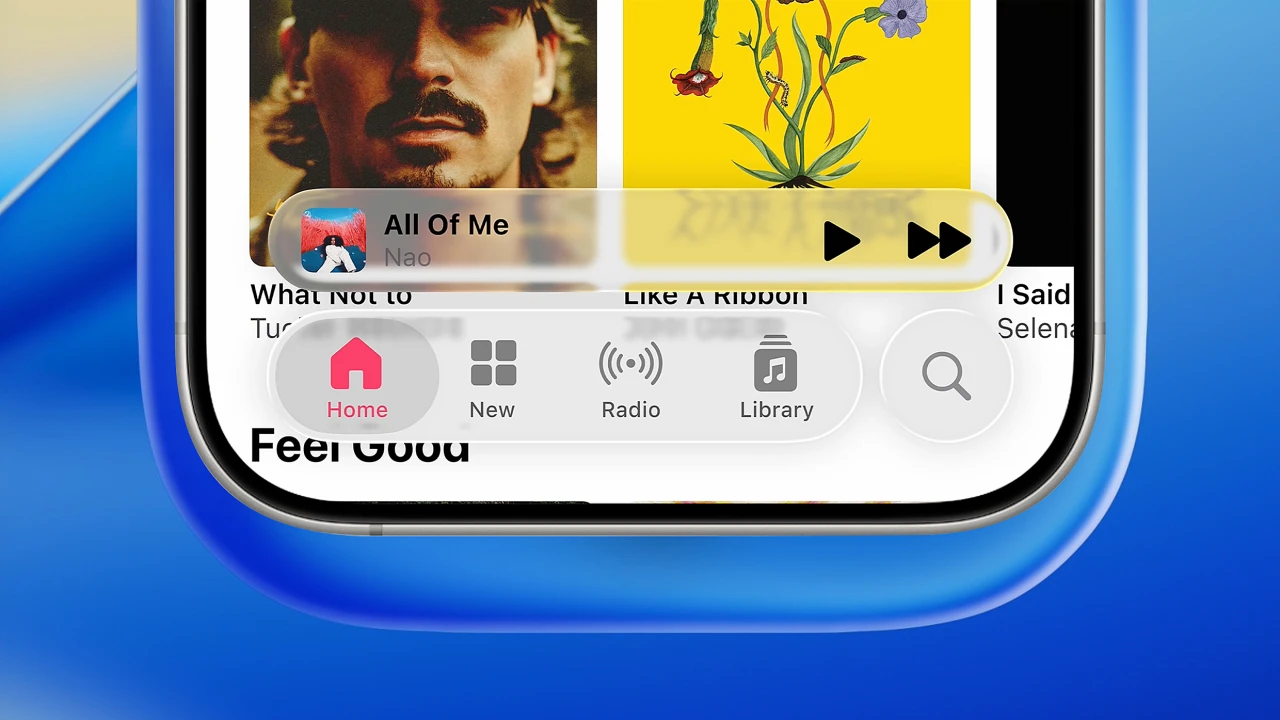
The basic idea behind Liquid Glass is this: Instead of the opaque windows and menu bars we’ve grown accustomed to for years, Apple products will be united through an amorphous glass-like interface. Everything from your app dock in iOS and MacOS, the play/pause controls of Apple Music, and the URL bar in Safari to the oversized digits telling time on your phone and the widgets on your desktop, will all be some level of clear.
The most overt of the updates comes in the form of a new magnifier and slider, which now seem to pop off your screen and bend the text and images underneath like a water droplet. Most of the other updates are more subtle. Turn your phone in your hand, and the new glass app icons appear to catch light around the edges.
Students of design will know that this is not the first time a big company has introduced transparency as a UX modality—nor even the first time that Apple has done so. The idea traces back to at least 2000 on Apple desktops with its Aqua interface. Aqua was like a digital manifestation of Apple’s semi-transparent computers at the time (ooh those candy colored iMacs). Apple guru John Gruber reminded me at WWDC that the processor-intensive transparency chugged slowly on those computers for years until they were smoothed out. Microsoft introduced the idea in Windows Vista not long thereafter. And since, it seems that every big tech company from Google (with its interface-as-real-object Material Design standards) to Meta (with its cutting edge augmented reality Orion glasses) has at least flirted with the idea of transparent interfaces.
Most recently, Apple used light-catching transparency for the menus of Vision Pro as a means to merge the UI with the environment. Apple confirms that Vision Pro was the inspiration behind extending that metaphor across its devices.
Trying Liquid Glass
It’s hard not to acknowledge a certain dichotomy behind the interface. On one hand, it calls attention to itself with gee-whiz animations. (And gosh, its magnifier really is one of the singularly best-rendered UI elements I’ve ever seen—so much so that it dwarfs the articulation of the rest of the UI.) On the other, it’s all just glass, so it’s inherently about disappearing to make way for the other stuff you see: namely your photos, wallpapers, and whatever other media you’re pulling up on your screen. Apple has leaned into more customized UI for years. Now, it’s trying to be the lens through which you view the world.
I was able to see Liquid Glass working across several devices. For the most part, the glass looks good. However, there are times that a glass menu bar feels muddled with color-heavy media—like that cover art in your Apple Music library. Often, but not always, Apple adjusts to such issues by cross fading the glass between a light mode and dark mode, much like a transition lens. That can feel like a solution to its own problem. But in other moments—like the airier keyboard spanning across the iPad screen—it’s refreshing to get some of your screen back as you’re literally less boxed in.
It’s why I think the most earnest assessment of the updates may have come from Craig Federighi, SVP of software engineering at Apple, when he said during the WWDC keynote that transparency gives the sensation of “making your screen appear larger.” It does. It basically allows any UI tidbit to feel more like the dynamic island on the top of your iPhone. Instead of cutting your screen off in a straight line, it floats as a little bubble that can grow larger or smaller as you need it. Safari now has a full bleed edge-to-edge web browser with a floating clear URL bar. In this sense, the update feels like a lot of work to give your phone a tiny bit more not-so-functional real estate. But once you see a bigger screen, it’s hard to accept a smaller one. It’s a major reason that, practicality be damned, our phones keep getting bigger. If Apple UI can squeeze another 1 milimeter out of your screen size through software, I imagine that it will feel claustrophobic to go back.
Where will Liquid Glass take us?
The problem with Liquid Glass today is that, beyond a few minor UI tricks, it doesn’t do anything new. The public is waiting for Apple to articulate how AI will add meaning in our lives—and instead we got a buncha glass. Functionally speaking, Liquid Glass is less significant than the new desktop-inspired windows on iPadOS, which ostensibly turns the iPad into a Mac. I suspect the last major update to the iPhone design language (when iOS 7 shifted to airy sans serifs from its skeuomorphic roots) will feel like a bigger design jump to most people who can remember.
One lauded designer friend calls the design update “masturbation,” while another dubbed it as superficial with “no thought.” A techie friend dubbed the whole event “the worst WWDC ever.” To be fair, Liquid Glass really is a mostly superficial update. There’s no significant new functionality added. It’s a luxe reskin. Apple says that’s by design—that it’s meant to feel new but familiar, to ease the countless customers across the globe into a new design language without disrupting day-to-day life.
No, that’s not the most reassuring sentiment from the greatest consumer hardware company in history—that it’s taking something of a slow and steady evolution to design more akin to auto manufacturing than OS design. However, I can get behind Liquid Glass version one as craft for craft’s sake: the height of making a UI feel one with its environment. 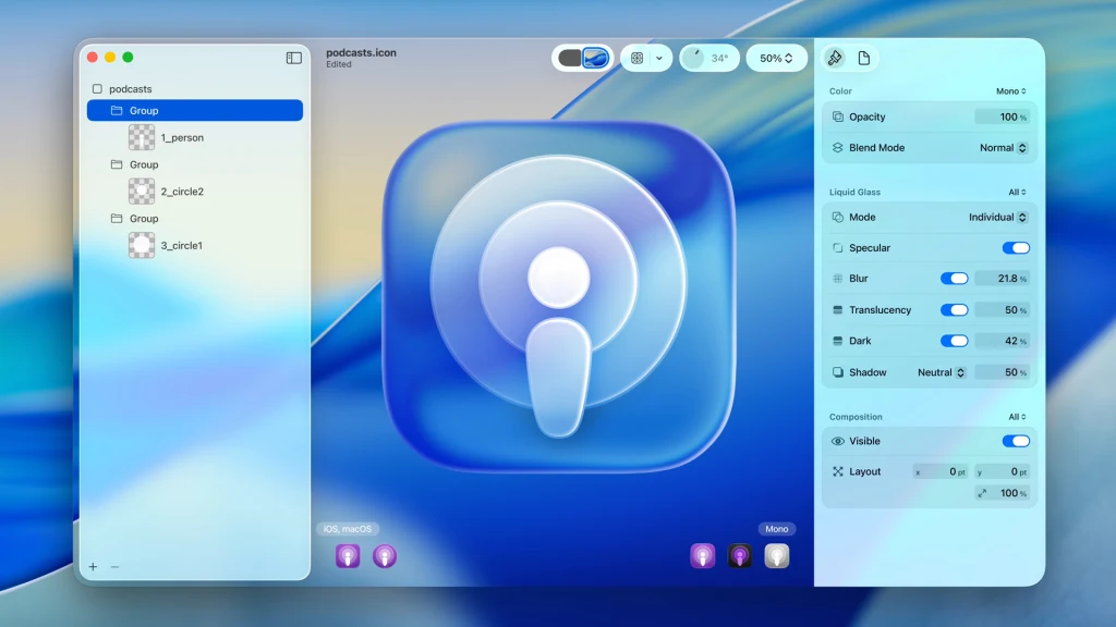
I’ll admit some disappointment that Liquid Glass’s specular (shiny) effects on the corner of app icons and other UI elements don’t actually react to light. These effects are pulled from the turn of your accelerometer rather than reacting to the real lighting sources in your environment. I get that most people probably can’t tell, though I suspect their limbic systems could note a difference. And I get that my alternative may be a ridiculous ask that would take even more processing power (and battery life) from your phone. But it’s also the very premise behind visionOS—an operating system that responds to your lighting environment to feel like one and the same thing. Part of me feels like, okay Apple, if we’re doing this—really doing this visionOS and reactive glass is the future of everything idea—then let’s use real physics. Let’s push the boundaries of tangibility to new heights. Make it all real.
That high bar aside, where I agree with Apple is what this enables in terms of longer-term strategy. Liquid Glass is a metaphor that feels primed for any permutation of AI or mixed reality that they might build in the future. It’s easy to imagine Liquid Glass for something as radical as generative interfaces. In this sense, it’s a remarkable hedged bet that sets a foundation for a lot of possibilities over the next decade. And in the meantime, all of us simpletons in the flyover states will just feel like their phones just got a teeny bit bigger.
I truthfully don’t think we can judge Liquid Glass today, and to some extent, I don’t know that we can this fall when it arrives on our devices. It’s a material metaphor that Apple has introduced but not really tapped—and looking at ambitions from competitors like Meta, it may be a UI approach that Apple can’t even own. We’ll only know in two to five years if, in this impossibly exciting era, the wonder glass takes us somewhere new.
And in that regard, it’s an apt metaphor for Apple, too.
What's Your Reaction?
 Like
0
Like
0
 Dislike
0
Dislike
0
 Love
0
Love
0
 Funny
0
Funny
0
 Angry
0
Angry
0
 Sad
0
Sad
0
 Wow
0
Wow
0