


King’s Hawaiian just got a fluffy rebrand inspired by its classic rolls
King’s Hawaiian—the maker of the sweet, buttery rolls that were a staple in many American childhoods—just got a fluffy rebrand.
The updated identity, which includes a new wordmark, logo, color palette, and packaging, was executed by the creative agency Mrs&Mr for King’s Hawaiian’s 75th anniversary. The brand crests this milestone at a tricky time for the grocery industry, as inflation and the rising cost of living continue to dampen consumer spending. Based on a report from the market research firm Circana, bread and rolls sales have declined by around 1% in the past year—but, in an interview with CNN, King’s Hawaiian chief marketing officer Raouf Moussa shared that the brand’s sales have actually grown year-over-year despite this overall downturn.
According to Kate and Daniel Wadia, the duo behind Mrs&Mr, the goal of the new look included a careful balance of two priorities: modernizing the brand while also reconnecting its identity with the decades-long heritage that’s turned it into an enduring source of nostalgia. To do that, they started by turning to the classic rolls themselves.
75 years of Hawaiian rolls
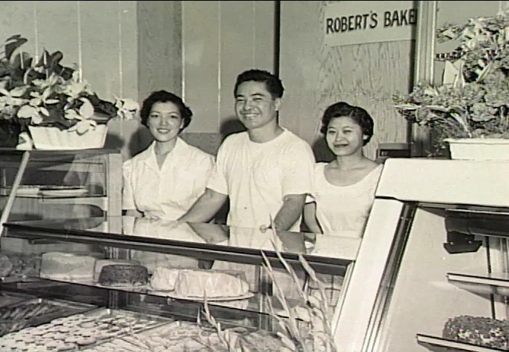
Before it became a packaged goods company, King’s Hawaiian was a small local bakery in Hilo, Hawaii, in 1950. Its founder, Robert R. Taira, was the Hawaiian-born son of Japanese immigrants, who ultimately perfected a more shelf-stable version of the Portuguese sweet bread he’d enjoyed in his childhood—an invention that would later become King’s Hawaiian’s iconic packaged Hawaiian rolls. King’s Hawaiian’s current CEO, Mark Taira, is Robert’s grandson. He worked directly with Mrs&Mr to help transform King’s Hawaiian’s branding.
“[King’s Hawaiian] saw themselves as this heritage brand that really needed to modernize, but also to stay true to its DNA and to its heritage,” Daniel says. “The impetus for the project was, ‘How do we become relevant to new generations of King’s Hawaiian consumers, while building on our legacy as this iconic brand that’s been around since 1950?”
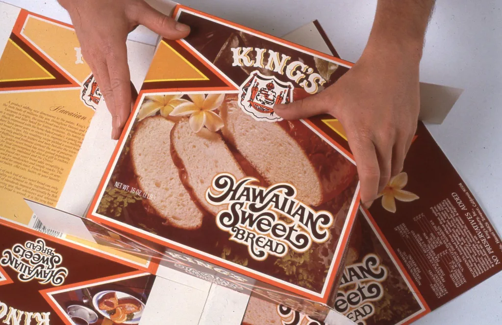
To answer that question, Daniel and Kate parsed through archival materials from the brand’s early days, including original signage, vintage packaging, and old advertisements. And, because Daniel grew up in London and Kate in Australia, they also had to actually try the product for the first time.
“Once we experienced the fluffiness, the squidginess, it reminded me of a French brioche—my mother’s brioche has that squidginess,” Daniel says. “We really saw an opportunity for both the crown itself and also the wordmark to reflect the puffiness and the softness of the product. We wanted it to feel as if it had been baked—like, literally, the logo just came out of the oven.”
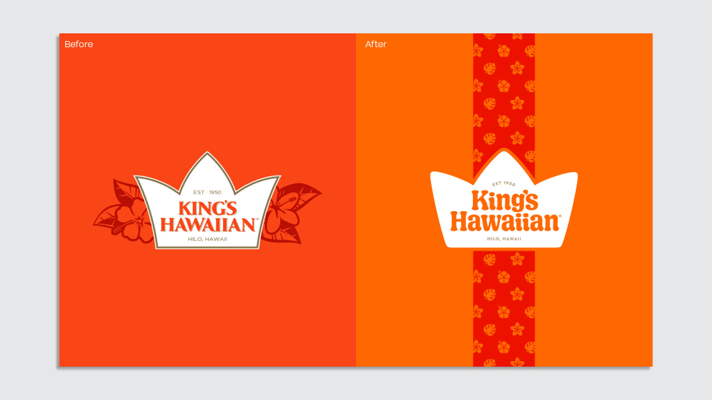
King’s Hawaiian’s former logo, adopted in 2018, included a thin, uppercase serif font, encased in a pointed crown and surrounded by a bursting floral motif. Kate notes that the look had a “messy” quality, but, more significantly, it also had a “very regal,” “formal” feel.
“It felt almost a little standoffish,” Kate says. “This product is a family recipe, there’s such love and warmth and humanity that goes into this product, that we wanted it to feel a little bit more approachable.”
Baking the King’s Hawaiian brand
To give King’s Hawaiian a friendlier feel, Mrs&Mr started by metaphorically “baking” the brand’s core assets.
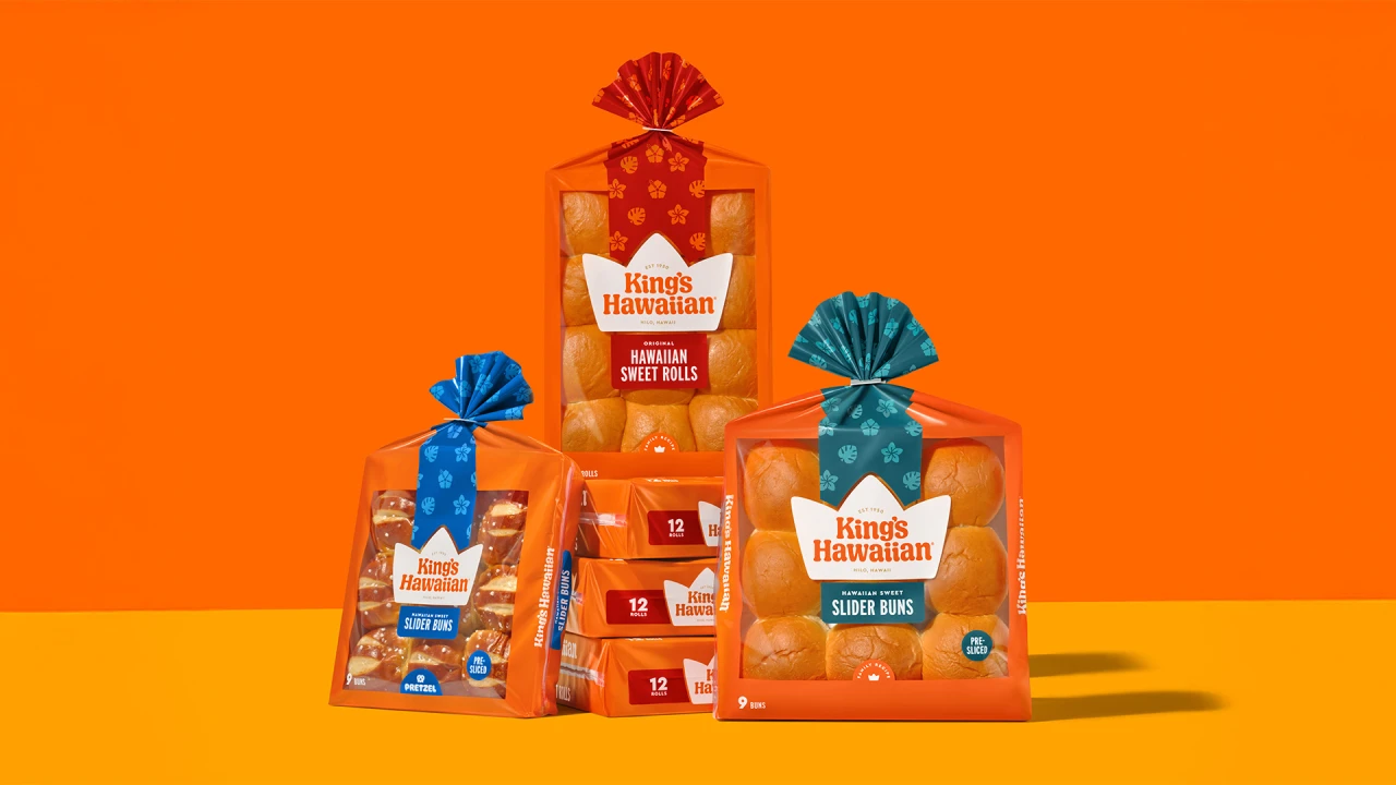
The crown logo, for example, has been given rounded edges and a chunkier feel. And, alongside lettering artist Alec Tear, Daniel and Kate developed a custom wordmark font that looks freshly risen. While the wordmark’s font is still a serif, in keeping with the brand’s history, it’s now bubbly and weighty. The dots above each “i,” as well as the letters’ tails, are shaped to mimic a puffy Haiwaiian roll.
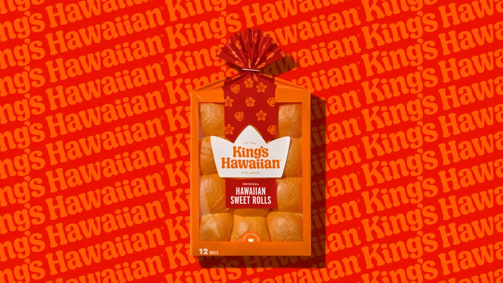
Crucially, Daniel and Kate decided to keep the brand’s signature orange packaging, which has come to be strongly visually associated with the brand. To give the identity a brighter feel, though, they lightened the core hue a few shades and kicked up its vibrancy. They also expanded the brand’s usable color palette to include complementary colors like golden yellow and bright red. In place of the packaging’s former floral motif, Daniel and Kate opted to add in a more simplified pattern of illustrated hibiscus, monstera, and plumeria plants, all of which are native to Hawaii.
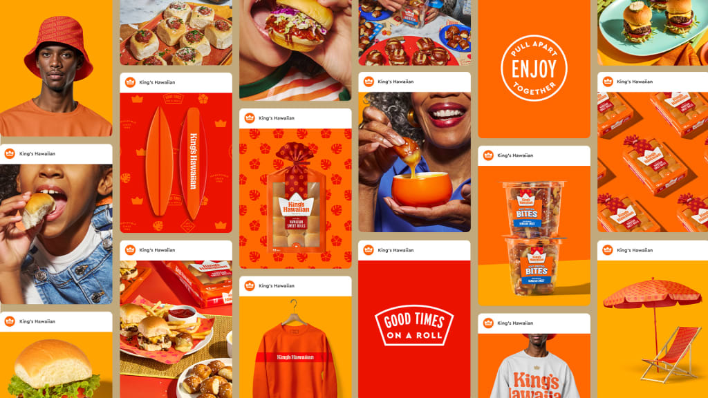
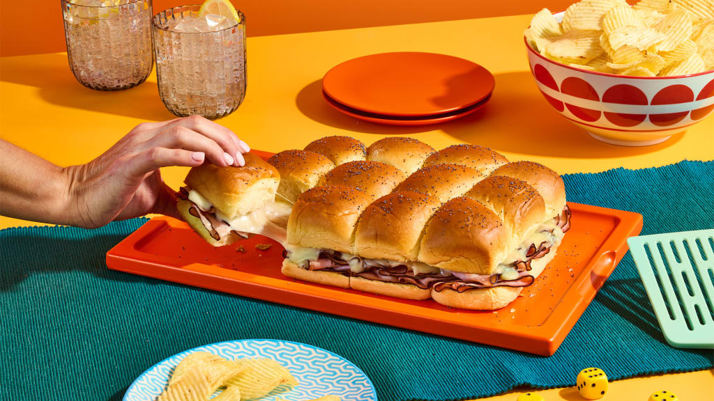
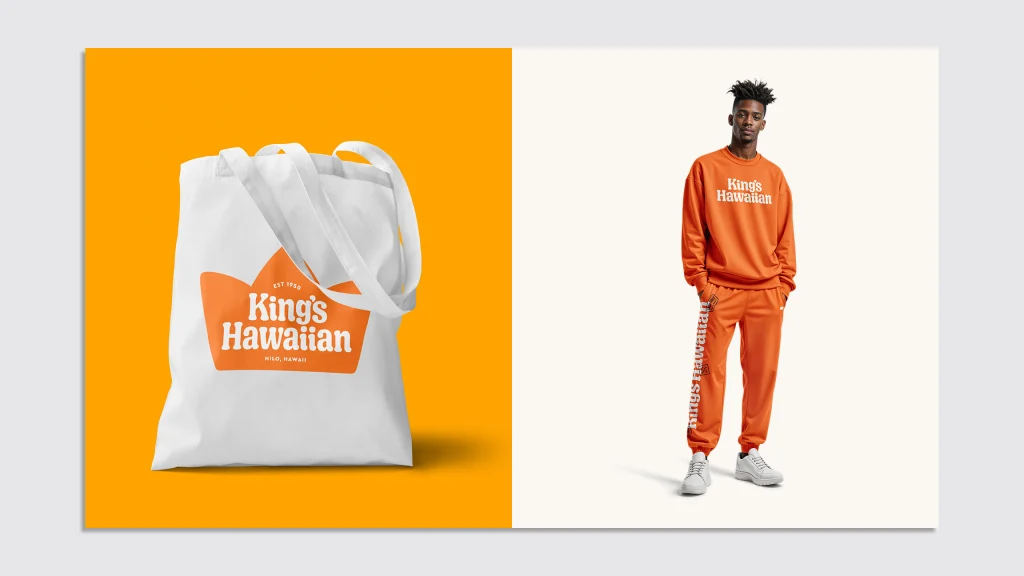
The result is a versatile branding system that’s now been applied across King’s Hawaiian’s entire portfolio of products, as well as on its website and social media.
“It’s an iconic, beloved American brand—and it’s something that people are very nostalgic about,” Kate says. “They sell King’s Hawaiian merch; people wear their T-shirts and hats and socks. So it’s really exciting, but there’s also a true responsibility when you rebrand these iconic brands that you don’t give people design whiplash: it has to be familiar, yet updated.”
What's Your Reaction?
 Like
0
Like
0
 Dislike
0
Dislike
0
 Love
0
Love
0
 Funny
0
Funny
0
 Angry
0
Angry
0
 Sad
0
Sad
0
 Wow
0
Wow
0